nav2

Showing posts with label superfrog. Show all posts

Saturday, August 3, 2013

Superfrog HD (froggy) - Demo, downloads and outcome

PLAY level 1 web demo link
notes: Best experienced with firefox.
It's missing sound effects (not implemented in code)
The hud wooden plank and other graphic glitches can be fixed in code, but the programmer/tech director abandoned the project.
Project is on hiatus/discontinued.
Controls: spacebar (jump), wasd, arrow keys(move), mouse click(throw spud),
Download APK for android devices
Download windows version.


The artstyle guide - review stage:

SF art style guide- review stage 
and Polish stage


What is my involvement in this?
- I was picked to do the art direction. Also do all the characters in the game. 2d and 3d animation,modelling,rigging,etc..
A big  part of my internship at Disney Interactive Studios was in assisting   the art director there.  This was an opportunity to continue the art direction experience somehow.
- Some of my previous "cartoony" art style fits with the target style of the game.

In order to explain how I affected the game, I need to explain the production steps of developing it's appearance and where I sat in this process. 

Stage 1 and 2 - Research and Art style development.
First of all the art director needs to develop and pitch the visual style of the game. I looked into different cartoon styles in games similar to superfrog - modern games. Looked into what works best for the target platform- mobile. 
Picking a style is not enough, one has to also define the characteristics of that style. Find good and bad practices, set a number of simple rules.  Feed into it a number of ideas that would give it some unique flavour.

Others in the team were welcome to create concept art, but during the style development stage I was the only person to create concept art of how the game can look like - the backgrounds, the enemies, superfrog himself. The style also had a goal to bring to modern day the original IP, so it was important to treat it's landmarks with respect. Team 17 was great in that they gave us feedback during preproduction.

A document called "the art style guide" is then formed and is something that the art director must constantly update in order to communicate with the artists on the team. It's like the bible of the game's art style.

Stage 3- Asset creation and review.
 At this stage, my role was to make sure that all of the assets fit into one style- they look like one person made them.
When we first started, all assets looked like they came from different games.

We have good artist, but they have their own styles that dont necessary fit with the game we are making. I reviewed the assets and made suggestions for how to change them to fit more with the rest. 

This is a very fine line to walk because a good  director should steer the art team to use a consistent style but not limit their imagination and creativity - on the contrary get them to put their minds and hearts into adding a level of quality to top the expectations. And the artists had that freedom..
 So while I asked people to do changes to their assets, in the end the background assets you see in the game are really their designs, their ideas, their work.

Mike made the modular pieces and their uv- making them easily manageable.
Sarah made the majority of props in the game  and textured them. 
Nareice put together the level layout, but I added a lot of props on top to make it look better.

The art style guide contains most of the changes I requested complete with screenshots and notes.

This style was  initially out of the artists comfort zone. 
But they adapted. Some of the assets were immediately approved. I set a rule to myself not to review an asset more than 2 times even if it needs it - that was at the point when we were running out of time.

Stage 4-  Level polish
At this stage I had to make suggestions about polishing the environments in the game. So working with the environment artists to ask them to do more on it- bring more to the level.
However in the last month of development all that was left was me and the main programmer.
 I had to repeatedly look at every nook and cranny in the level and make sure there is nothing that seems out of place or missing.
This is the current stage of production. There is still a lot of work to do on it. Some decals and assets are missing. Animations are not all implemented in code. Graphics are missing. A lot of the suggestions are not applied yet. Sound effects have been recorded but not implemented. A lot is not implemented in code.

This is the prezi we presented as a team to the university- on our final d4i day.

The deadline- Game republic
 Game republic was our deadline. In the last month everyone abandoned work on superfrog (almost) in order to focus on their individual entries. I had an individual entry too, but I continued to work on creating marketing material for the event and ironing things out.

At the end of this journey Team Stilton won the 3rd place in Best Artwork for the game, which was renamed to "Froggy" for the event.  We won the against over 20 other entries.

"Just add water" gave us the award, crediting the "art direction" work in it.

 If we all had worked harder, I am certain that we would have gotten a 2nd or even 1st place. Unfortunately our entry was incomplete and not polished enough. It became clear when seeing the competition.

Sunday, June 2, 2013

Superfrog - animations


I did all the characters and their animations in the  froggy  game.

The main sprite:
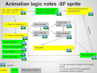
The first stage of that process was outlining all of the actions he is going to do in a sort of a state machine mockup that I had to run through with Lutfi Couri, who is the main programmer on this project.  This  exact same thing was done for all of the other 2d and 3d objects in the game that contain animation clips.

The original superfrog sprite served as an inspiration, but I did take quite a few liberties with the character both in terms of design and animation.
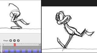
During the pencil test, I would use layers in order to animate him one set of body parts at a time. The same approach is used in maya with the help of character sets. It's good to start with the root of the action- the torso/spine for example. Then animate on top of it the legs, then the arms, then the head, then the cape and so on. Layers are a good way of experimenting with animation for the different body parts.
Unfortunately pencil doesn't have the ability to duplicate layers, but is otherwise an excellent flipbook app.


The second stage was to go into toonboom studio, get the pencil tests in there , set the right resolution and form the animation library. Some of the body part animation is frame by frame, some is made by just squashing,stretching and rotating them. A well set up character rig in this case is key to easy pose-to-pose animation process. Sometimes when doing posing my character, I would go and pose the entire body frame to frame.

Third stage - after testing the sprite in the game, making sure it looks alright in perspective with the 3d background + camera angle, making sure the clips blend together alright and are at the right speed... I added some cell shading to it, some highlights, cleaned up the lineart and tweaked some things- then rerendered it.
Some of the animation clips (resized gifs) : run fast,run slowdie


Animation on 3d assets:

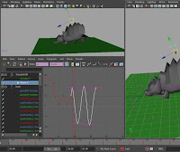
The enemies in the game were quite fun to do. Very similar in workflow- mockup state machine, do key poses then add secondary motion with some overlaps. It sounds like a lot, but it was very hastily done. I went straight to auto tangent and did very little work on tweaking the curves.
Find the extreme poses of what drives the secondary motion, then create the keyframes around those up and downs. Once they are at the right place, all one needs to do is push the secondary motion by scaling the keyframes on y in the graph editor.


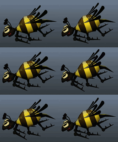
Some more gifs here.

Sarah modelled and textured this mushroom. I changed the model's geometry a bit, then rigged and animated it.


Simple quick mushroom rig:
Made of 3 joints, no blend shapes. Set driven key+ aim constrains.

Problems(hopefully not too visible) When squashing the trunk loses some volume- that couldnt be helped as we cant use blendshapes or waste too many joints to go all around the trunk.
I added some squash and stretch to the head as well, but cant be bothered to update this gif.

Sunday, May 5, 2013

Making tile-able textures with inkscape

I made the tiled textures on the environment pieces in froggy.
 Mike modelled and uv-ed them, I made some changes to his Uvs before texturing them.

Here's what we have so far:
 There are two types of textures in the game:
-walls - need to seamlessly tile both on X and y
-platforms - need to seamlessly tile on X

One thing that I had to figure out for myself was how does one do tiling textures in vectors?
Well, there is some software out there. Some lets you do it in real time, other (such as adobe illustrator) does it automatically after you make your texture. I was interested only in the first type, as the second didn't give good results and was harder to control ,as it is trying to guess.

Seamless studio (shareware - ??$) is designed to do the job, however it has no transparency,gradients, blurs or any other fancy vector features. All it can do is import the path data and apply a colour to it. I decided it's way too limited to even consider buying!

Pattern studio (shareware - 68$) is a very nice piece of software that specialises in tiled textures- both by using vector and bitmap tools. It has many of the effects one would wish to have from the vector world and some of the ones from the bitmap world. While I did like it, I decided that the interface is a bit slow in terms of workflow and would also take a while to learn.

After all this research, I ended up using
 inkscape (open source - 0$) again. It's fairly easy to setup  your vector file in a way that allows to make a seamless tiling.

Mini tutorial:

0. set the Document properties to be 512x512. 

1. Create a base colour square - 512x512 in size, set its xy position to 0. select the square and ctr+g to put it in a group. It's important that the size of that group is the same as the one in document properties.

2. Set up your grid, so it breaks the canvas 10x10 - just the way it is in Maya's uv editor by default. This is useful when used with snapping and for reference. To do it in inkscape, divide the document size by 10 (in this case 51,2 x 51,2).

3. After that is done, clone your square group 8 times. Move the clones to another layer above the one where the original is and place them around the original. This is where the snapping to grid feature comes in handy- you need to snap them precisely. If thats not enough you can make one or two more circles of clones around that you have and use clipping to hide the most outer circle. Lock the layer with all the clones.

Now in order to edit your texture, all you need to do is enter the original's group and start adding new shapes inside it. You will notice that when you draw out of it's document boundaries, the clones above it will emulate the effect of tiling by drawing whats outside on top of the other side of the texture- giving you an easy way of making it tile.

If you want to improve your visibility, you can set the clones layer to multiply and/or reduce its transparency. Dont forget to set that back to normal before you export.

Exporting different texture sizes:
When you export you can get different sizes by multiplying or dividing the default dpi (90) by a factor of 2.
1024x1024=90dpi*2 = 180 dpi
 256x256= 90 dpi / 2 = 45 dpi


Wednesday, March 13, 2013

Some good practices in rigging

Getting closer now to my gant chart's deadline for Superfrog reboot game, I have to now rig and animate the 3 low poly enemy characters that I made.

I am going to take the opportunity and talk about some of the good practices in rigging that I learned and borrowed from other riggers.

Divide your rig into two systems- a motion skeleton and a deformation skeleton

From previous posts I made on the subject, you will find that some of the good rigging scripts out there have this feature.
 I used advanced skeleton on 2 of the 3 rigs.

Following this sort of a rigging model, I decided to give the hedgehog some love and rig it myself from scratch!
It took an hour or so to get it done, and I came up with the rig as I went- so it's not the greatest rig- it's pretty simple.

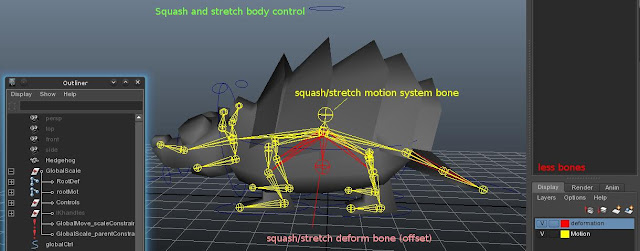
So first I made a motion system skeleton and rigged that (in yellow). Nothing special- just 4 IK handles for the legs, so I can move his body up and down while the feet are on the ground.
I also made a squash/stretch joint and hooked it to a controller. The controller uses set driven key to squash the body when i move it down and stretch it when moving it up- just like you would with a ball rig.
The jaw and the ears are aim constrained to cv controllers.

Then I duplicated my motion skeleton (after testing it) and called that copy - deformation skeleton. Cleaned it up from any copied constraints.
Then I parent (and on some joints scale) constraint all the deformation bones to their motion bone equivalents- motion joints controlling deformation joints. Now since one skeleton was totally overlapping the other, I moved them to their own layers(on the right panel - colour coded it in red).

Then I skinned the character mesh to the deformation skeleton.
Now if you look at the screenshot, you will see that wherever there is a red bone showing- that is where the differences between the deformation rig and the motion system start:


1. his legs on the deformation system have one joint less each- since those are no longer needed by the ik handle - they are drivven by the motion system legs that have ik handles.

2. His tail initially had 2 joints. Since he is a character to go to a game engine, I changed my mind after skinning it and took out one joint, even though I have animations over it.
The nice thing is that even if you remove moving joints in the deformation system, your animation doesnt get affected at all, it's just not going to be exported. If I want to bring it back, all I have to do is add that joint back and parent constraint it to the motion system joint that actually has the movement coming from a control curve.

So deformation rig has 5 joints less in total. 5 joints less for the games engine.
I can also potentially get rid of all the 9 end joints (no skin weights on them), which leads us to 14 joints less for the engine.

Essentially you can remove any deformation joints without damaging the motion system.
And vice versa- one can add new motion controls without damaging the existing deformation joints/skin weights. Simplifies things!

3. If you look at Squash stretch joint, you will find that the deformation one is placed lower than the motion one.
Since the motion system squash stretch joint only drives the scale of it's deformation system twin, It's easy for me to remove it's influence, move it anywhere on the model(the pivot of squashing and stretching is at the bottom, not the middle of the body) and rebind it.
4. The body is skinned to the squash/stretch bone. The root joint has no influence on the mesh and can be instead driven as a global controller in the games engine.I might have to change it around a bit later, but having the rig split into two systems will make life easy in doing that :)


Tidy outliner structure- easy to reverse engineer
I like the outliner tidy! All ik handles have their own group. All the controllers have their own group with nothing but cv curves in it. Everything is in the globalScale group. The global controller is out of that group since it is parnet/scale constraining it.
It's important to be tidy, as it makes life easier in the long term- say they ask you to add new features to the rig or debug the rig.The less one has to dig through long lists and hierarchies to get to something, the better.

Leave some offset space with your constraints
By this I mean that it's good to have something like a group between a driver of a constrain and it's target. When you constrain something, you can no longer put keyframes on it (the blendparent node is another story) - It's hard to add some offset to that motion. More often than not animators like to tweak things, so it's always nice to leave that control available, even if you locked and hid it temporarily not to confuse them.
So what you see in good rigs is this tendency of putting the target object in a group and constraining that group instead of the target object- you get an extra pivot. Using the motion-deformation rig approach gives you that added bonus and keeps the outliner tidy.
It's an especially important rule, when you rig props that the character interacts with.


Tuesday, February 19, 2013

d4i- Low poly stuff and using vectors to texture again

There is really no point in doing sculpting and retopology when the characters are really really low poly.

There is quite a lot I could get away with topology-wise, given that the shader is  to be shadeless and wouldnt have any normal maps - the only thing that has to work is the silhouette and the deformations.
The game engine triangulates the mesh, so I am allowed to use as many tris as I want to.
in order to preserve verts.
Instead of making uniform meshes, I would split a mesh into shells - to save on faces.

It took a few hours to get them from scratch to UV unwrapped stage. A nice thing about the mirror modifier in Blender is that it folds all symetric UV islands that its mirroring automatically when you apply it - one half over the other whilst putting the left side islands on top of their right side counterparts. This is not good if your model will use normal maps (as noted in a previous post in this blog), but its incredibly useful when you want to save UV space for obvious reasons. If you unwrap(again) after applying the mirror modifier, blender unfolds them in completely symetrical islands that are normal map friendlier. It's still very easy to later flip one half over the other if need be.

The shells are all uniform and no stretching for as long as you mark the seams right. Doing this is Maya is a hassle (without $$plugins??). Autodesk, please be more competitive and improve your uv unwrapper. :P

For the UV seams, I like placing those where I know a different colour/material of the character will begin. For example the snail's shell and skin would be on sepparate islands. This makes texturing easier later. I like cutting seams on the side of the character where I know the camera won't be looking.

Priority was given to UV islands that are going to have transparent sprites (bee wings, hedgehog spikes).
Islands that are on areas nobody will ever see (the mouth interior of the hedgehog or the bottom of the snail) I scaled down as much as possible - gave them very little uv space.
On top of that I used the snapping options to overlap identical uv islands (the bee's knees, legs,etc).

Next step , I exported the UV layouts and got them in inkscape, to be vectorised.

This splits the island shapes that were bleeding into each other. From there its a matter of Path>difference. 

This then gave me a nice and easy base colour for each island (picked it straight from the concept art).

Using vectors allows me to export it to any resolution, while having it small. Just as I did with the concept art, I decided to keep all of the enemy textures in one file, so it's easy to track if they are consistent in style, polish and execution. I used masking, clipping and other tools. New feature in inkscape 4.9 called "select same" allows you to select all objects with same fill colour, line colour, style, etc automagically. Useful when used with "union" to merge shapes, saves loads of time when colouring.

The three models can share the same material and therefore UV space. In total they are 685 faces (as you can see in the pic). I might have to add a few extra edgeloops on the snail's neck, might take out some geometry...


Tuesday, February 12, 2013

d4i - round 2 - Superfrog remake game for Team 17

This is for a group (team Stilton) project that I am part of in term 2 of my final year in University - design for industry module.
The goal is to recreate a 90ies classic platformer game by team17 and make it relevant in today's market. The name of the game is "Superfrog". The target platform is Iphone/android smart phones.

This is what we pitched to Team17, at their office:
It went very well. They were impressed by our progress so far and the approach we are taking.
 The presentation slides 13-21 are the ones that I worked on and presented.

A little disclaimer about the game:

It's merely a demo of the first level and a test to see how it works out as a modern remake. At this point, it's just an university assignment and a fan-made game.
Team 17 is awesome in a way that they will aid us with feedback.
Please note that I (and the others) have signed an NDA paper as well.

However, due to the nature of the legality of our university owning the demo, this game is likely to not be bound by secrecy. This can be very positive, as it allows us to seek the most hardcore superfrog fans out and get them involved!

We want to create something that not only pushes the graphics and makes it competitive/relevant today, but also keeps all the core ideas that hold a special place in people's nostalgic hearts.

It's going to be a brave remake that brings it back to life with a kick.
That means adressing the old art style, adressing the level designs, adressing everything - so its extra "Super" :D .

EDIT: Today Team17 announced and made it public that they are remaking Superfrog.
They did tell us that they are working on a remake at the meeting, but we did not see it. Our game is not to be confused with that, as it had no impact on the development of the official remake, nor did the official have impact on the development of team Stilton's superfrog.  I never saw the official concept art or assets while working on the art style guide and my concept art. Looking at the sprite, mine is very different in character design. They kept with the original more, while I used a number of tricks to make the character look more like a frog and sneak in some more superman references. It's a good thing that we didnt see how othe official one looks.

That said, we are NOT working on the official Team 17 game. It will be interesting to see how our game is different to theirs, as we take an alternative route. :)

 I was assigned as Art director and lead character modeller and animator  but also ended doing the majority of the concept art.
During the christmass break, I compiled an art style guide that looks into the graphics of different platformer games and reverse engineers their approach. It also contains a big number of changes that our game will have from the original.
Here is the WIP art style gide:


As work in progress, please note that it is going to change, new slides will be added, old slides might be removed or changed.  

Here are some of the pencil tests of run cycles I did for superfrog:


The concept art for the enemies:
I picked a number of the original enemies from the old superfrog (depending on how often they appear in world one and how much time it would take to animate- snail has no legs, bee doesnt walk, hedgehoog's knees are hidden). Using Artrage 3, made a quick concept drawing of some of these enemies and decided to model three of them.

And finally the concept art for the level itself:

To create that I decided to be a bit cheeky. The background (skybox) plate was drawn in artrage, then imported to inkscape.
The reason I chose to use inkscape(VECTORS) for the midground (and some of the BG that will paralax):
- It allows me to create clones of a single object. When I change the original, all of the clones update to accomodate the changes. This is very useful when you need to make the asset fit with the rest of the environment. It saves time!
- It forced me to be modular even in the way the level concept art is made.
- It helped me understand possible issues in art style when starting to put the assets in Unity. I numbered those issues and wrote them on a notes layer.
- Much smaller file (since its made of mostly clones of just a very few actual objects)
- Less destructive editing
- Helps me preview if a tiled texture is tiling well.
- This approach gives a nice and easy png files with transparency (grass strands) that are already named to export to a consistent directory.
- Textures and assets can be used in unity as placeholder graphics. The vector nature of the file means that the object size in the file is the size you get when you export, but that can be multiplied by the dpi factor and  give very crisp and clean images in any resolution due to pixel snapping.

I shared the source SVG file with the rest of the team to play with. Some of the team members expressed interest in using it as a starting point, others with no experience or desire for vector graphics decided to stick to photoshop.

The programmers on the team were able to put together a quick unity demo with the assets from my svg file for the presentation for Team 17. Experience in creating gameplay mockups at Cogworks and Disney interactive paid off!

I am sure that game designers would be smirking at the idea of putting a platformer style gameplay on a touch based device without buttons. Team stilton has come up with a number of ways to accommodate the limitations. We are going to take on that challenge. The game will hopefully have an online ( unity 3d engine) demo which anyone can play for free in their browser.

Wednesday, December 26, 2012

Reusing 3d animation and rigs for games - research report for university

One of the university modules in this semester had for an (optional) assignment the research of reusing character rigs and animation to be imported to a game's engine.

I was given a deadline to write a greenlight pitch, a research paper (almost 30 pages!) and then create a technical demo video.

 It's pretty much do it yourself sort of a thing set by university(just as many other things).
In this case before even delving into reusing animation clips, I decided that it's more important to find out what exactly are the best practices in character rigging and animation for game engines - where the data has to be created in a specific way that will make it friendly to use by the programmers and the engine.

In the research paper I used for sources the excellent presentations on animation in Uncharted 2 by naughty dog, among  other things.It was a bit rushed so It got me 64.4% .

For the video, I used kdenlive to put together a quick overview of the findings of experimenting with some of the tools in Maya:

http://youtu.be/YOuWO8My84c

That got me 85 % .

The paper and the video focus on the work that is done in the animation package rather than the game engine. I have in the past done character modelling, rigging and animation for Unity 3d. That first experience was a bit of a trial and error - the animation data needed to fit with how the character actor is scripted.It's something that I will keep fo a future post, until there is time to put together a demo of that game.


Monday, December 24, 2012

D4i-term1 - Car safety game for Himex

One of the final year modules of the University of Bradford is to work in a team (of 4-6 students) to deliver a product to a real client (with a deadline, for free).

The team that I joined is made of 6 people:
- 2 programmers.
- 3 environment artist/modellers/generalists.
- 1 animator/illustrator- me.

In this blog I have decided to (selfishly) write only about my own contributions to our projects.
This is to avoid any unconvenience on the other member's side - maybe they dont want me to say this or that. Also there is a lot to write and it's best to pick my battles when it comes to this blog. Posts are LONG as it is.Other team members have their own blogs and time to write.

We all did a BELBIN test before having permission to form a team.
My Belbin results (strengths that are also my weaknesses according to the test) gave out the impression that I am good at:


The Belbin team report had this to say for my role in the team:
"should do most of the problem solving or be responsible for coming up with any new
ideas and suggesting solutions to the rest of the team."

My technical role in the team is Illustrator,Animator, Character modelling.

As a start, my job was to design a T-shirt picture to be used to present our team.The idea of the shirt and branding is by the whole team :
I did this with inkscape, as usual. There was a limitation of the number of colours for printing

Produced a number of variations for the rest of the team to vote on. The catch phrases and the name (like a sir) were some of the other team member's ideas. We tend to end most of our presentations with a bad pun joke involving cheese. it's important to leave a smile there.
.
I was team leader during Term one, but I asked to step down from that position and focus on animation for term two. Leading a team can become stressful - I dont have the time and energy to do a great job at it, while also contributing so much to development. It doesnt really give you any power if thats what you think - a good team leader shouldn't force ideas but rather keep people on topic during the meetings, keep everyone heard and make sure that everyone is on track and knows what they're doing.


What the experience taught me is that a group leader is someone who is passionate about and good at organising other people. Someone who constantly keeps motivating others and reminds them where they should be at a given moment with their work.
So it was a tough job ,especially when there is no office place and everyone is just juggling with uni work.
In industry that person who organises things would be the producer. He or she would elect who should be in charge of what and keep everyone in line, keep communication between the people and so on.
Not a job for the ideas person.
The group leader should not be personally biased by ideas, but should make decisions based on what's best for the project and sometimes what would keep everyone happy.


There is also a lot of infrastructure organisation  that I really am not good at and other team members did instead of me.

So each term has one project. The project in term one was to deliver a game pitch to HIMEX - a car insurance company- for a game that brings awareness about car accidents. The target audience is young drivers. Teens. This is the client's brief.

Everyone in the team proposed a game idea. This is what I proposed initially - two ideas.
They were fed into a team discussion and everyone from the team added some really great ideas to make it more fun.
We decided that an IOS game will need simpler contros. I pitched for a pacman like design where the car moves indefinetelly by default and you turn left and right by timing your tap at the turns.

This is the second presentation we made...
Everyone had a say what goes on each slide, but we divided who does and presents each slide in the 15 minute slot.
The slides that are in GREY are the ones that I mostly worked on.They are half arsed because of me.

For the final presentation, we used Prezi.
I didnt do a lot on it, but gather images.Some things were changed for the game pitch, based on the team's decisions, a public questionaire of the target audience (over 80 people) and the client's feedback from the last presentation.A number of new devices were added to the game idea and some designs were removed.I presented the game pitch slide only.

The presentation was a success. The client just gave us a lot of praise and no critical feedback(alas).
It's in no way a complete design document and does have it's quirks, but what went in there as a pitch really left Himex impressed and "inspired" to make a game.

However, we are not going to be developing this game for Himex, because we already have Team 17 as a client for term2's design for industry project. But let's leave that for other posts when the subject has matured enough..:)