nav2

Showing posts with label concept. Show all posts

Tuesday, January 28, 2014

Winning Game Jam plovdiv

This year we participated in the first global game jam event in my home town- Plovdiv.
"Team Chameleon" was formed out of 5 people: 2 programmers, one graphics guy (me) ,a musician, and a level designer.

You can play the game HERE in your browser.

And THIS is it's entry page- on the global game jam website.
Howto play the Demo:
Please note that the game doesnt have a loading screen yet, so you will need to wait a bit for the graphics to load from the web. 
The astronaut can see in one of the 4 different color spectrums. Hit spacebar to switch between them and make their platforms visible. Also note that seeing in a color spectrum also makes you SEEN by the monsters that exist in that spectrum. The goal is to get to the bunker! :) 


The game won us the industry game jam award- given to us by gameloft!
------------------------
Organisation

During the first day of the event, when the topic was revealed:
"We don't see what we see, we see what we are" (or something like that)
All I did was wonder around and try to get to know people in the room - find out what their take on the theme was and also to see if I can find some programmers. 

The initial idea of the game is that we, as human beings have a limited perceiving of the world - for our eyes can not see the complete spectrum of light. This idea came to be after a chat with a color blind guy, whom I met at the event (what are the odds).
After finding 2 excellent programmers, or more like them finding me- we got together at the table and had to come up with a game pitch in less than 30 minutes!

For this part the best thing for me to do was to allow for everyone to shoot ideas and on my part-write them all down on a piece of paper and compile the pitch. 

Some of the ideas were:
- Colored vs black and white
- Perceiving things in a wrong way (in different colors)
- Seeing only things in certain colors.
- Forcing the player to memorize where platforms are
- Point and click items in a room in a sequence - in order to proceed to the next room (puzzle)
- Platforming (voted on this - it's a popular genre that people understand)
- At the end of the brainstorming session I enforced on the team the need for antagonism. Memorizing platforms is not enough to keep the players on their toes. Thus enemies need to be hidden in every color spectrum.  

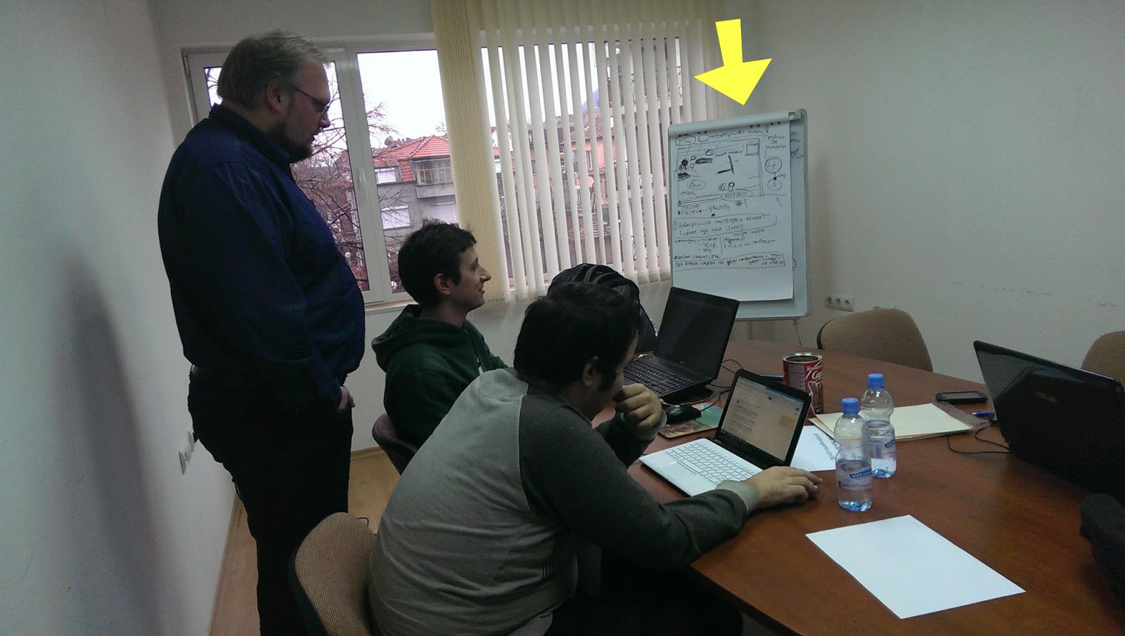
After the pitch was done, I got everyone on the team sit down together and flesh out the idea.  We were 4 people in the room -  having us all vote wouldn't have worked, so my involvement in this part was not to vote on ideas. Instead I sat outside the idea pool and acted as a mediator. I outlined our production plan on the white board -going through everything we need, see if everyone is on the same page and if not- let voting do the work. People brought up valid issues in the design and they voted on the best solutions - fleshing out the design. Would invincible platforms still act as platforms or not? Would invincible enemies continue to chase you while you don't see them? Is the outlined plan realistic for the 48 hours? What are our priorities- which features can be labeled as "extras"? What do the programmers need from me- the artist and from the rest of the team. What resolution would the game run in. How big is the sprite. And so on.

While one of the event organizers told me that we are wasting time with this planning, I still believe that one hour wasted on planning saved us from several hours wasted in arguing and headaches. I have been through this with other teams in the past and I knew what a recipe for little disasters looks like. It's when problems are brought up really late during production!
---------------------------------------
Workflow
First of all, game jam is an event in which a team has to make a game in 48 hours. Since I was the only graphics person in the entire team, I had to choose my battles wisely.


It started with an animation pencil test (done in pencil2d) - so i can give something to the programmers early on- for them to test with and also for me to get an idea about sprite size. This would later determine the line thickness of the final sprite and also the detail design.

Next on I looked for inspiration from "The forbidden Planet" and other b-movie posters from the silver screen era of awesomely cheesy 3d movies.
And thus drew the initial background- as tall as the game resolution and as wide as I my heart desired (then cropped it).   

Using Artrage- for it's natural media tools. Those helped me get closer to the poster vibe. Back in those days artists had no computers. I even faked some scratches on the paper and extra paper grain.

Having a BG tile lets me establish the overall color palette of the game - something that is a reference point when choosing colors for the player,platforms and enemy sprites - those need to stand out.

For the final sprite animations I used Toonboom studio. This allowed me to tweak colors and crispy line thickness. Finally- exporting to any size that my heart desires (or more like the programmers desire)- one of the greatest advantages of vectors.

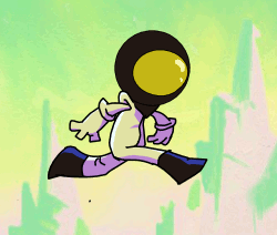
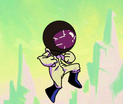
Both the enemy and the player sprites are animated inside the same file- to save time and to have an easy way to compare them. The enemy design and coloring is inspired by a stylistic effect some pulp posters use - depicting it as a dark shadow with a detail defining neon rim light(s).
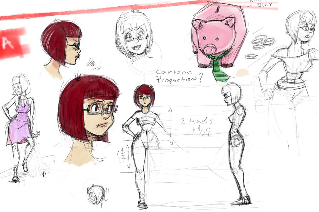
I managed to plan enough time for doing some 3 tone cell shading on the player sprite. The programmer required me to export both the player sprite and the enemy sprite in 4 different color mode versions. 


I know I could have done this as a cut out animation rather than inking all the frames. I chose to do it the proper way because setting up a cut out rig alone would have wasted that time anyway- the sprite animations are short so it wasn't worth it compromising their quality. If they were longer or the programmers needed it cut out for some procedural things- like armor swapping- then I would have had used "Spriter" instead of toonboom studio.

All this and much more was done in less than 48 hours!!!
Even managed to speedpaint a picture for the title screen during the last thirty minutes.

The title picture reuses the Planet graphic. There is the obvious mistake of having a different number of fingers. That index finger sure is crazy. But this is what generally happens after some sleep deprivation. :)

What didn't make the cut:
Our level designer kept insisting on having different backgrounds (suns) for each color mode. I resisted  because it complicates the core "hook" of perceiving colors and it is also creating more work for me.
He also insisted on having cut scene drawings to tell a comedic narrative. While this was welcome by me since his ideas on those are really entertaining- I decided not to do it because things with more priority were not finished. 
If we had more time I would have had the programmers change the font at the title screen, fixed the issues with my own half baked graphics, had insisted that platforms in the game are jump through type rather than solid, had insisted to place a different background for each level and a different music too (the musician made more than one tracks for the level) and many other things.
But this game is finished now and it's time to move on to better things. :)

Tuesday, February 12, 2013

d4i - round 2 - Superfrog remake game for Team 17

This is for a group (team Stilton) project that I am part of in term 2 of my final year in University - design for industry module.
The goal is to recreate a 90ies classic platformer game by team17 and make it relevant in today's market. The name of the game is "Superfrog". The target platform is Iphone/android smart phones.

This is what we pitched to Team17, at their office:
It went very well. They were impressed by our progress so far and the approach we are taking.
 The presentation slides 13-21 are the ones that I worked on and presented.

A little disclaimer about the game:

It's merely a demo of the first level and a test to see how it works out as a modern remake. At this point, it's just an university assignment and a fan-made game.
Team 17 is awesome in a way that they will aid us with feedback.
Please note that I (and the others) have signed an NDA paper as well.

However, due to the nature of the legality of our university owning the demo, this game is likely to not be bound by secrecy. This can be very positive, as it allows us to seek the most hardcore superfrog fans out and get them involved!

We want to create something that not only pushes the graphics and makes it competitive/relevant today, but also keeps all the core ideas that hold a special place in people's nostalgic hearts.

It's going to be a brave remake that brings it back to life with a kick.
That means adressing the old art style, adressing the level designs, adressing everything - so its extra "Super" :D .

EDIT: Today Team17 announced and made it public that they are remaking Superfrog.
They did tell us that they are working on a remake at the meeting, but we did not see it. Our game is not to be confused with that, as it had no impact on the development of the official remake, nor did the official have impact on the development of team Stilton's superfrog.  I never saw the official concept art or assets while working on the art style guide and my concept art. Looking at the sprite, mine is very different in character design. They kept with the original more, while I used a number of tricks to make the character look more like a frog and sneak in some more superman references. It's a good thing that we didnt see how othe official one looks.

That said, we are NOT working on the official Team 17 game. It will be interesting to see how our game is different to theirs, as we take an alternative route. :)

 I was assigned as Art director and lead character modeller and animator  but also ended doing the majority of the concept art.
During the christmass break, I compiled an art style guide that looks into the graphics of different platformer games and reverse engineers their approach. It also contains a big number of changes that our game will have from the original.
Here is the WIP art style gide:


As work in progress, please note that it is going to change, new slides will be added, old slides might be removed or changed.  

Here are some of the pencil tests of run cycles I did for superfrog:


The concept art for the enemies:
I picked a number of the original enemies from the old superfrog (depending on how often they appear in world one and how much time it would take to animate- snail has no legs, bee doesnt walk, hedgehoog's knees are hidden). Using Artrage 3, made a quick concept drawing of some of these enemies and decided to model three of them.

And finally the concept art for the level itself:

To create that I decided to be a bit cheeky. The background (skybox) plate was drawn in artrage, then imported to inkscape.
The reason I chose to use inkscape(VECTORS) for the midground (and some of the BG that will paralax):
- It allows me to create clones of a single object. When I change the original, all of the clones update to accomodate the changes. This is very useful when you need to make the asset fit with the rest of the environment. It saves time!
- It forced me to be modular even in the way the level concept art is made.
- It helped me understand possible issues in art style when starting to put the assets in Unity. I numbered those issues and wrote them on a notes layer.
- Much smaller file (since its made of mostly clones of just a very few actual objects)
- Less destructive editing
- Helps me preview if a tiled texture is tiling well.
- This approach gives a nice and easy png files with transparency (grass strands) that are already named to export to a consistent directory.
- Textures and assets can be used in unity as placeholder graphics. The vector nature of the file means that the object size in the file is the size you get when you export, but that can be multiplied by the dpi factor and  give very crisp and clean images in any resolution due to pixel snapping.

I shared the source SVG file with the rest of the team to play with. Some of the team members expressed interest in using it as a starting point, others with no experience or desire for vector graphics decided to stick to photoshop.

The programmers on the team were able to put together a quick unity demo with the assets from my svg file for the presentation for Team 17. Experience in creating gameplay mockups at Cogworks and Disney interactive paid off!

I am sure that game designers would be smirking at the idea of putting a platformer style gameplay on a touch based device without buttons. Team stilton has come up with a number of ways to accommodate the limitations. We are going to take on that challenge. The game will hopefully have an online ( unity 3d engine) demo which anyone can play for free in their browser.

Tuesday, December 4, 2012

Some cartoon shading research


Why the long interest in cartoons?
A quick and cheap real time material, capable of pulling off a "cartoony" look would be useful to quickly show off models. It makes sense to apply a cartoon style rendering to a film/game that has cartoon style character designs to begin with. This style is still a niche that some titles have successfully exploited in order to stand out visually in the 3d crowd. It's a style that is quite popular on mobile games!

+ Cuts production time?
+  Cheap to render -even real time- can be used in both film and video games
+ Easy?
- Obviously fake
- Can look cheap if not done well. Technology alone doesn't necessarily pull of the great end look.

Lets look into some of the ingredients that can be used to achieve this look

Cell/soft Shading  
-We need to tweak or remove the falloff of a realistic shading to simulate the effect of cell shading. We can do this in a number of ways. Starting with a flat surface shader ("shadeless" in blender) will remove any realistic shading on the object.

By baking the shadows onto the texture- This seems to be a common method with low end games. Baking shadows on to texture is a common practice by AAA games too. They do that in a way that the player doesn't really notice it, as the technique (also known as Lightmap baking) is applied only to non-dynamic shadows that in theory don't need to change. Lightmaps are used to generate ambient occlusion maps, fake colour bleeding from light sources and bounce lights (global ilumination). Developers do that and many other things to optimise their levels, to squeeze more fps.

I made a kimba cartoon 3d fanart model to try this idea.

For the first time I did my 512x512 texture in inkscape. There are some great advantages in using vector software for cartoon styles- be it 2d or 3d. It's easy to tweak colours and curves without the need of a messy eraser,lasso-ing or millions of layers. You can also upscale your texture to any size you want. Its pixel precise and smooth. Every pixel counts.

For some cartoon character designs, it's better to use flat surface eyes (instead of spheres). I left space around the irises in the texture, making it possible to animate their movement by animating the UV.
But if I animate them, they will need to be on a separate uv map.

Depth map shadows can be useful to add to it
Depth map shadows are shadows cast by an object that interacts with a light source. They're cheap, but not completely realistic - lacking opacity/blur falloff calculation. These things can be procedurally faked with post effects.
I tend to avoid having these shadows as the default completely black. Its nice to give them some sort of a warm dark tone, possibly use a ramp, possibly set them to multiply and render them on their own render layer, so they are easy to tweak in post.


Matcaps
This is a very well known shading method to Zbrush users. Matcaps are a great way to get some material and light properties on your mesh- without the need to set up a light rig and tweak shader properties. Instead all that information is stored in a single image file. Map that file to the normals of your model and you get a sort of an overlay that fakes material properties and interaction with lights, based on the angle of the camera.

There is a number of ways one can create matcaps. I made three matcaps- the first one with inkscape, the second one with MaCrea and finaly the third one with blender's nodes.

Outlines can be generated by a matcap, but they don't work out as well as the other method. The matcap seems to be better suited for fake rim lights:

A rim light created by a matcap. As you can see coordinates are set to "normal", I toned down the color value (it acts as a sort of a layer transparency in this case) and set the material layer to "Multiply". This is how you get matcaps in Blender.

 --> 


To create the matcap for the rim, I took a soft outline matcap I made in Inkscape, inverted its value and set its layer to screen, so I can give that black color a bit of a warm brown hue. This avoids desaturation/ugly shadows.


+This is good when you want to quickly preview the mesh in a closer to rendering situation (zbrush).
+It can be used to produce a cartoon outline and at the same time things like a rim light, secularity and soft shading- its very easy to tweak those by editing a single matcap image file or combining multiple matcaps.
+Some video games have successfully used it to cheaply create unique visual styles.
-Looking at a matcapped model is like having your viewport camera be the lightsource.
It doesnt look as if you're rotating around an object, but more like the object rotating on a clay pottery table. This can throw off the audience if the camera is orbiting around the target.


Cartoon outlines (outlines)
Mesh clone + normals trick- This popular method ( almost sure that Okami and Zelda windwaker use it) works in most real time rendering viewports. I found it to be the easiest approach.
To get it, simply duplicate your mesh,  then give the copy any dark material (uv texture, matcap,solid black color,etc). Flip its normals. Scale all its faces along the normals (alt+s in blender) , so its slightly bigger than the mesh- this also controls the global line thickness.

Tweak the outile mesh with your sculpting tools. The grab and smooth brushes are surprisingly good at manipulating the amount of outline, depending on the angle..

You can do this same thing with the solidify modifier if you're too lazy ;)

--disadvantages: Dublicating the mesh doubles the polycount, hence processing power. It also introduces the complexity of linking it to the character mesh. This should be done procedurally to avoid headaches when dealing with blendshapes. Perhaps doing a weird mesh proxy trick? I'll let you know if I find out.


Cartoon lines and shading can also be achieved by using the z-buffer pass ,the normal pass, and other passes - run those through a node tree and create the effect in post.
There is a lot more written on the topic here
My biggest issue with that can be
- Lack of full control over specific lines/shadows
- Lack of interactive feedback when tweaking values- freestyle render engine for example still needs to render out an image to show the lines. It would be best if it could update and preview in the opengl display.


Wednesday, October 10, 2012

Personal research during the internship - Characters


Having a job can take too much of your daily energy to be able to get on with short films. So as you might have noticed, there is a big gap in updates at this blog. Nothing posted here for a year!
Some of the time felt right for me to look at  my favourite childhood cartoons and games and try to evaluate what made them special at the time. Studied their art styles, analysed their stories .
Part of that was replicating the stylized characters in 3d- researching how to make that transition possible and what might get lost along the way .


 Kimba the white lion fanart model- made it hastily with metaballs in blender . Retopoed with Bsurfaces. This is a demonstration of the dublicated mesh approach to cartoon lines real time rendering. 


I thought a lot about types of character designs in eastern and western culture, trying to classify them in my head. It was sort of fun to reverse engineer characters, while thinking how their design tells the audience their story and sets them up to be the part of the fiction that they are in.


Making sketches helps me get the shape in my mind - inspires me to model my own characters.

There were some styles that I feel personal distaste with, so I avoided taking anything from them even though they are famous.
If you're in the mood of some more jibber-jabber on what I think of anime today, please visit my other blog, where I posted a huge rant on the subject.

Sunday, October 24, 2010

Summer ends and project Piggy bank


Well, I worked all summer. No, it wasnt for a studio or anything like it. So I couldnt get more good stuff to put in my portfolio. So there is a lot of catching up for me to do now.


My 2d and 3d animation (malfunction and Stoneage) were shown at a couple of festivals, one of which the Moscow festival of Contemporary Animation . Unfortunately their website is in flash, so in order to see my entry, you need to go to English>Participant2010> and I am under number 44


EDIT: Just received a honorary letter from the general Producer of the festival.


And while being at it, here is a screenshot of the finalists page of CG coach awards, where you will find me listed. I am putting it on a screenshot, just in case they take the website down.


Second year of university started and I've been busy doing all sorts of class assignments. Somehow inbetween the whole chaos, there is still time for me to have fun with new software.

Let me first start with whats my homework for this semester. A 30 second (tops!) 3d animated film featuring a girl lifting a heavy object. I already had two storyboards which I was eager to do, but then a certain someone decided that students should have less choice. So the tutor gave me a list of types of characters and things they can possibly do.
This was the one that:
a) everyone else was not doing
b) tolerable (one of them "auditioning for x factor" urgh and they expect me to do it without any voice/sound)

So I picked the girl scenario and quickly scribbled this storyboard literally a couple of hours before the deadline:
https://docs.google.com/fileview?id=0B4WmGlTeh8z8ZTJhOTg1N2ItYjBmMi00MzRlLTgyM2EtNWQ1ZmY3NGE2ZTE3
I still feel that the ending is weak. Maybe I can change it somehow.

And here is the concept art that I made:


Made with my favorite open source painting app- Mypaint

And then I modeled the girl with zbrush, fixed her topology on the hands and added detail in Maya. The retopology tool in zbrush 3 would create holes in the area of the hands. So the easiest approach there is to just do the tricky parts in Maya or blender.

Next on is UV mapping and texturing. Since the character is with a cartoony design, I decided to avoid putting much realistic details. With 3d its very easy and tempting to make the model pointlessly detailed, but less can be more in this case. UV mapping and texturing was done in Blender 2.54 and took a couple of hours.

Blender-uvSeamsScreenshot

I decided to give the new Blender a try, because it has some tools that are better than Maya's at the moment. Uv unwrapping and sculpting mode are especially nice in blender. My hope to see a better sculpting mode in Maya is almost nonexistent since Autodesk also owns Mudbox and likes it when people keep buying it.:P So yeah, its also 0$. Of course it has some annoyances and quirks, but the more I use it the easier it gets. Texturing mode in blender lacks symetry, or at least I couldnt find it. Also pressure sensitivity for my tablet model didnt work, so I made the simplest most basic texture possible.

blender-polypainting

Her shape still needs some tuning. I will use belnder's sculpting mode to fix the hips/legs and head. I noticed that when I import it and soften the edge normals in Maya, her proportions look kind of different to the eye. That might need some adjusting too.

My goals with this animation are:
-learn Blender 2.5 and integrate it in the pipeline (70% done- I need to learn more)
-use maya dynamics - Maya hair or Maya cloth, but keep it very cheap on CPU/render time. Do that after the animation is complete.
Deadline is till the end of semester one. This new knowledge will help me create the next project- a storyboard that I've been working on for a while now.