nav2

Showing posts with label character designs. Show all posts

Friday, May 22, 2015

Creating all the 3d graphics for a Kinect game - to teach kids how to cross the road


 A few months ago I just finished working on a game with Tri-soft.  It was created in Unity and was using Kinect for input.  The Goal of the game was to be a part of a larger event that is aiming to teach kids about road safety in a safe environment. The game came out and it even got some media coverage. Seeing as to how kinder-gardens and schools are using it now, I would class it as a successful project. You can watch the media coverage here (more pictures and video)
The deadline for it was tough. I had a month and a half to create ALL the 3d graphics in the game. The entire pipeline - including animations on three kids - one on a bicycle.
When we first started, the game was planned to be photo-realistic. It had no art style guide. So what I did was make one and offer it to the client - before doing any concept art or even modelling.  

I had to make sure that I know that they know what they want and I know what they want! :)
I offered them a short presentation of two styles - a cartoony one and a realistic one. Then left them to decide which one fits the target audience (little kids) more. The choice was obvious.
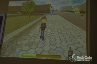
It was great that they went with the cartoony style, because it was much faster to produce (not requiring any normal maps) and it worked with the limitation of the old computers they have at the schools.
The target device handicap also forced the team to use Unity instead of Unreal engine.
 I couldn't get the game to look as good as I wanted to, due to the deadline. But I am somewhat happy that it is at least out there. Of course, I had to make some changes along the way to meet the client's demands. Also those ground textures were not my job.
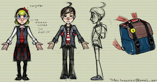
For the characters:  After submitting a quick concept art drawing, I didn't get any reply so everything seemed fine. However when I got to the stage where the models of both kids were ready and textured, the client asked me to change the girl's dress completely, give her pigtails, change the boy's hair color and give him a red cap. In these cases, stuff like that always happens, but it is better to have something already made and easy to alter, instead of keep waiting for the client- halting the production. It's best to have something to give to the programmer to play with early on.
The changes were in part with the issue of having the game displayed with a digital projector. The colors were getting washed out and it was not easy enough to see on the screen in which direction the kid's head is looking- looking at it from behind. I had to use very bright colors. On why they wanted both kids to be blond - I have no idea :D
I had to use my time wisely. In order to meet the deadline and leave some extra time for unexpected issues and client demands (which of course there were some) - I planned the assets in a way in which I can reuse things. Even at the stage of the concept art, I designed all three kids very similarily - where shapes deform - so as to be able to reuse the geometry of the first one to create the other two. This also allowed me to partially reuse textures (instead of starting from scratch), reuse skin weights, the rig and partially even animations!
The kid on the bicycle was a bit more complicated. Due to the bicycle being partially controlled by player input, I had to create a rig for it in a very specific way. That required a lot of back and forth communication with the main programmer. Thankfully he was a great guy and helped out a lot technically.

Finally the last dynamic object in the game that had to be designed was the car! For the car I wanted something that looks like a toy. The programmer asked me kindly to use more realistic proportions for the car in terms of distance between the tires. This wasn't too big of a problem anyway. Both the car and the bicycle were made in a way that would allow him to control their steering and speed dynamically with code. That part I didnt have to animate at least. For the bicycle I did all the animations, in a way that would still leave him with some control.
After all that concept art and planning, it was time to do the actual models! Even when you look at their screenshot, you can really tell that they have the same base mesh (which probably is not a good thing, but time was not on my side)!


 For the buildings: A big part of the work was done in blender. The excellent modifier and instancing system allowed me to create a big number of assets very quickly and save a lot of time in UV unwrapping. 


 Before modelling anything, I went out with my camera and took reference images of real places and things. The school is based on a school that I used to go to. The kindergarden is the one I grew up in. Even the ugly Eastern European communist style Blocks in the game are based on one that I used to live in.


 Each model of a building was planned in advance - so as to pack textures in the most efficient way and use the smallest amount of geometry possible. In terms of UV unwrapping/texturing, it was important to take note in advance which were the repeating elements in a building and what Islands I can overlap or even flip in order to save uv space - giving each building texture more resolution if the client wants more detail later on.

There were quite a lot of buildings to make. Some of them had more than one different variations- In texture and in number of storeys. On storey variations I simply used the array modifier. There was also quite a lot of mesh instancing used and snapping.  When modelling all the assets, I kept them all in a single blend file that (at least in theory) had the correct units set to export and also had some consistency in art style.

Finally here is a trailer of the first version:

Most of all I am glad that the game was made for a good cause. I hope that none of these kids ever gets run over when crossing the street. Would be nice if they liked playing the game too of course. :)


Speaking of good causes...

I used Krita for texturing. It's vector layers and color adjustment layers made my life very easy. It even has ALOT of amazing features that photoshop does not have and probably wont get anytime soon. Things like brush stabilizing, more than one brush engines, layer instancing, wrap-around view mode (great for tiling texture painting), a vastly superior to the bucket tool  fill algorithm (via gmic), and many more are completely missing in photoshop at the moment. Krita is free and open source - unlike Photoshop it doesnt require monthly subscriptions and is available on Linux too!

They currently have a cool kickstarter campaign to fund development and bring more features. Most of all the campaign is to get krita to run faster than photoshop and to become a dedicated 2d Animation application as well - meaning a complete animation system - unlike the one in photoshop!

You can download it right now and start playing with it. The funding campaign comes with some great goodies- such as an awesome learning dvd course for example.

Tuesday, January 27, 2015

Gamejam 2015 - Ignite the Knight

I participated in this year's global game jam event - in Plovdiv. We were a 5 people team and we made a 2d html5 game. Gamejam offers only 48 hours to create a game. A big part of this time is taken by  other activities connected to the event.

My job in the team was to make nearly all the graphics in the game- all the environment art and player sprites!
You can see the GameJam entry here --  globalgamejam.org/2015/games/ignite-knight 

Play the game here online!

And a video Demo here:
 

Game Mechanics

The topic of this year's GameJam event was " What do we do now?".
We had a number of ideas for the game. Starting with a point and click game where the pilot has passed out drunk and you are one of the passengers trying to land the plane by guessing which button to press. We came up with variations of this idea with a boat and a bomb. But it all led to a game where guessing was the main mechanic and the player was not in control of the situation at all.

Next on we thought of a top down game, where the player is forced to navigate his/her way through a maze. In order to enforce the theme of gj2015, we made the floor collapse - forcing the player to constantly move.
I asked further to make the player continuously run in a direction - so it is impossible to stop moving.
The programmers were against it at first, but then after some talk on how it will help compliment the topic of the event and how to implement it, they caved in.

Part of the reason I wanted the continuous run mechanic was also the character design that I had in mind at the very start.


Animating the player Sprite:


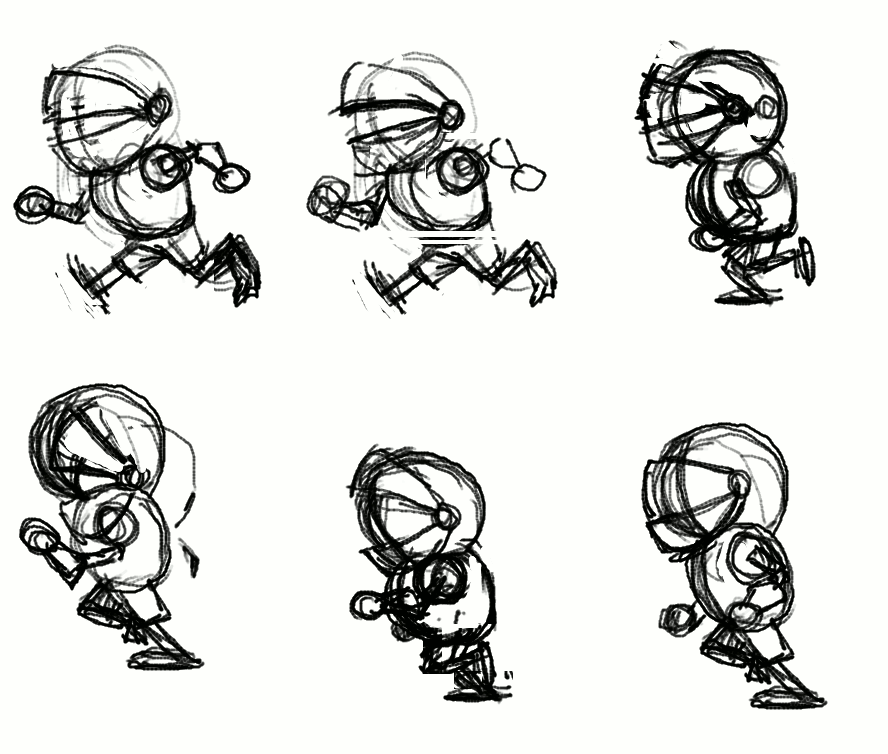
I started with a rough animation test in Pencil2d - which I gave to one of the programmers as a placeholder, so he had something to work with early
on. I made three placeholder sprites - side, front and back - of the run cycle! It is a bit messed up in the gif file here, so apologies.
The placeholder sprite is required to figure out how big the character will be on the screen and to implement the code for triggering the animation. This later on would drive some of the character design decisions- such as the thickness of the line, the size and amount of details, how tall he is and so on.


Modelling the Knight

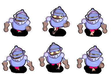
Since the perspective in the game is top-down, the player sprite would require at least three versions for each animation it has. This led me to the idea of using Blender3d to make the sprite.
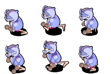
The idea behind the character is all aimed to compliment the continuous run gameplay mechanic. The knight has no shoes on and the floor is really really hot - running in his underwear, he is trying to get to the end. In this case the top half of his heavy armor is not helping the situation one bit. As you can see from the sketch, the character design is really really simple. It is taking into consideration how small the sprite would be on the screen. I modeled him out of really simple shapes - as quickly as possible. Then his colors were added via Vertext Painting - to skip the Uv unwrapping step altogether.  Since the final sprite would be 128x128 and the extreme limitation of our deadline, I couldnt afford to give him fingers.
I used rigify for the armature, but removed the bones in the hands and added extra bones for the helmet- to create a humorous secondary action later on.

Animating the Knight in blender

The knight has 5 actions in total:
Run, Idle (jumping on one place), Jump (over lava), Win, Die.
While working on the animations, I stumbled on some of the pet peeves that I have with blender's animation system and gui design. For example the lack of autoframe mode for f-curves and some other niceties that I missed from maya. I voiced my opinion at the forum.

The biggest problem came when blender wiped all of my animation data when closing the file- Without a warning! It nearly killed the project. Thankfully I already had my sprites rendered. However, It robbed me of the opportunity to further polish the animations and add a red ribbon on top of his helmet- for more secondary action.

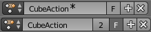
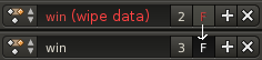
The automatic purge of animation clips , which by default have no user assigned to them is a decisgn decision in blender that has plagued a lot of users before me.  Blender deletes animation clips by default when you close your file and it doesnt warn you. One must click on a small "F" button in order to tell blender not to delete the animation.
Since this terrible design has caused too many examples of data loss, I filed a bug report on the issue with the hope that developers will address it accordingly! For example Blender could warn you that it will delete a clip by color coding it and appending a "(wipe data)" message to its name or an asterisk symbol. I made a few mockups!
https://developer.blender.org/T43430#288111
While being at it, I also made a rant at blender artist about it and  suggested the Auto frame feature. One of the developers responded by making an implementation - to which I gave my feedback.


Rendering the sprite pipeline:


This project was a great way for me to test the latest version of my ADVANCED NPR SHADER -ver4 in a real production environment with a deadline. The shader gave the knight model a nice hand drawn style, which fits with the overall art direction of the game.
The cartoon line was achieved with the solidify modifier and another special outline shader.

Next on I had to set up the camera rig and the scenes. There are 3 scenes, which share a camera rig with 3 cameras- it was the only way to get blender to render a target from three different angles and give a conveniently rendered animation sequence for each action from three sides.


Painting the Tiling sprites for the Environment:


For the environment it was no brainer to use Krita. It has a feature that gives it a HUGE advantage over Photoshop - The wraparound (w) viewing mode  makes it very nice for painting tiling textures! Also the ability to clone layers, the numerous different brush engines and awesome interface. Krita is just wonderful.


Conclusions:

For this year's Game Jam event - I managed to meet most of my goals:
- The game we made was more ambitious and had much more graphics than the one from previous year!
- I used open source software for the entire pipeline! In the process I discovered bugs and design flaws, which were clearly voiced to the community and the developers of that software. I contributed back this way.
- I tested the Advanced NPR Shader -v4 in a real production environment with a sharp deadline. This shader will be made available some time in the future- along with a learning video course. It's one of my ongoing personal projects :)

In Other News: 
Gmic developers added a very useful feature that I suggested! This is exactly why I love open source software. Very often when you have an idea, the developer actually looks into it and if he likes it- BAM! It's right there a day after it was suggested:


The colorize filter is a great alternative to the traditional bucket fill tool. Give it a try. It's available in both Krita and Gimp.
-----------------------
Omake - some music I made with renoise in my free time:

Tuesday, January 28, 2014

Winning Game Jam plovdiv

This year we participated in the first global game jam event in my home town- Plovdiv.
"Team Chameleon" was formed out of 5 people: 2 programmers, one graphics guy (me) ,a musician, and a level designer.

You can play the game HERE in your browser.

And THIS is it's entry page- on the global game jam website.
Howto play the Demo:
Please note that the game doesnt have a loading screen yet, so you will need to wait a bit for the graphics to load from the web. 
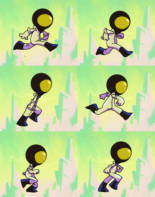
The astronaut can see in one of the 4 different color spectrums. Hit spacebar to switch between them and make their platforms visible. Also note that seeing in a color spectrum also makes you SEEN by the monsters that exist in that spectrum. The goal is to get to the bunker! :) 


The game won us the industry game jam award- given to us by gameloft!
------------------------
Organisation

During the first day of the event, when the topic was revealed:
"We don't see what we see, we see what we are" (or something like that)
All I did was wonder around and try to get to know people in the room - find out what their take on the theme was and also to see if I can find some programmers. 

The initial idea of the game is that we, as human beings have a limited perceiving of the world - for our eyes can not see the complete spectrum of light. This idea came to be after a chat with a color blind guy, whom I met at the event (what are the odds).
After finding 2 excellent programmers, or more like them finding me- we got together at the table and had to come up with a game pitch in less than 30 minutes!

For this part the best thing for me to do was to allow for everyone to shoot ideas and on my part-write them all down on a piece of paper and compile the pitch. 

Some of the ideas were:
- Colored vs black and white
- Perceiving things in a wrong way (in different colors)
- Seeing only things in certain colors.
- Forcing the player to memorize where platforms are
- Point and click items in a room in a sequence - in order to proceed to the next room (puzzle)
- Platforming (voted on this - it's a popular genre that people understand)
- At the end of the brainstorming session I enforced on the team the need for antagonism. Memorizing platforms is not enough to keep the players on their toes. Thus enemies need to be hidden in every color spectrum.  

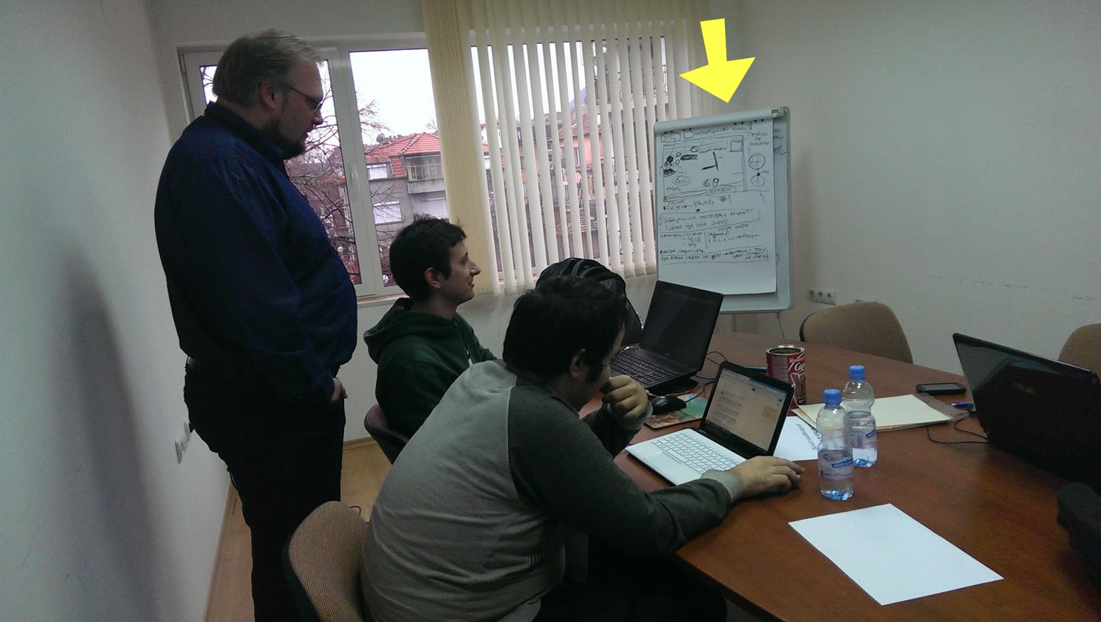
After the pitch was done, I got everyone on the team sit down together and flesh out the idea.  We were 4 people in the room -  having us all vote wouldn't have worked, so my involvement in this part was not to vote on ideas. Instead I sat outside the idea pool and acted as a mediator. I outlined our production plan on the white board -going through everything we need, see if everyone is on the same page and if not- let voting do the work. People brought up valid issues in the design and they voted on the best solutions - fleshing out the design. Would invincible platforms still act as platforms or not? Would invincible enemies continue to chase you while you don't see them? Is the outlined plan realistic for the 48 hours? What are our priorities- which features can be labeled as "extras"? What do the programmers need from me- the artist and from the rest of the team. What resolution would the game run in. How big is the sprite. And so on.

While one of the event organizers told me that we are wasting time with this planning, I still believe that one hour wasted on planning saved us from several hours wasted in arguing and headaches. I have been through this with other teams in the past and I knew what a recipe for little disasters looks like. It's when problems are brought up really late during production!
---------------------------------------
Workflow
First of all, game jam is an event in which a team has to make a game in 48 hours. Since I was the only graphics person in the entire team, I had to choose my battles wisely.


It started with an animation pencil test (done in pencil2d) - so i can give something to the programmers early on- for them to test with and also for me to get an idea about sprite size. This would later determine the line thickness of the final sprite and also the detail design.

Next on I looked for inspiration from "The forbidden Planet" and other b-movie posters from the silver screen era of awesomely cheesy 3d movies.
And thus drew the initial background- as tall as the game resolution and as wide as I my heart desired (then cropped it).   

Using Artrage- for it's natural media tools. Those helped me get closer to the poster vibe. Back in those days artists had no computers. I even faked some scratches on the paper and extra paper grain.

Having a BG tile lets me establish the overall color palette of the game - something that is a reference point when choosing colors for the player,platforms and enemy sprites - those need to stand out.

For the final sprite animations I used Toonboom studio. This allowed me to tweak colors and crispy line thickness. Finally- exporting to any size that my heart desires (or more like the programmers desire)- one of the greatest advantages of vectors.

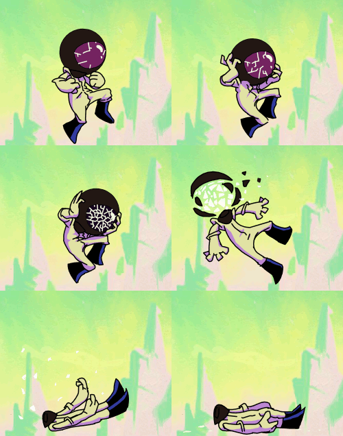
Both the enemy and the player sprites are animated inside the same file- to save time and to have an easy way to compare them. The enemy design and coloring is inspired by a stylistic effect some pulp posters use - depicting it as a dark shadow with a detail defining neon rim light(s).
I managed to plan enough time for doing some 3 tone cell shading on the player sprite. The programmer required me to export both the player sprite and the enemy sprite in 4 different color mode versions. 


I know I could have done this as a cut out animation rather than inking all the frames. I chose to do it the proper way because setting up a cut out rig alone would have wasted that time anyway- the sprite animations are short so it wasn't worth it compromising their quality. If they were longer or the programmers needed it cut out for some procedural things- like armor swapping- then I would have had used "Spriter" instead of toonboom studio.

All this and much more was done in less than 48 hours!!!
Even managed to speedpaint a picture for the title screen during the last thirty minutes.

The title picture reuses the Planet graphic. There is the obvious mistake of having a different number of fingers. That index finger sure is crazy. But this is what generally happens after some sleep deprivation. :)

What didn't make the cut:
Our level designer kept insisting on having different backgrounds (suns) for each color mode. I resisted  because it complicates the core "hook" of perceiving colors and it is also creating more work for me.
He also insisted on having cut scene drawings to tell a comedic narrative. While this was welcome by me since his ideas on those are really entertaining- I decided not to do it because things with more priority were not finished. 
If we had more time I would have had the programmers change the font at the title screen, fixed the issues with my own half baked graphics, had insisted that platforms in the game are jump through type rather than solid, had insisted to place a different background for each level and a different music too (the musician made more than one tracks for the level) and many other things.
But this game is finished now and it's time to move on to better things. :)

Monday, November 12, 2012

Soda trip - animatic

For a final year project, I am going to do a 2 minute 3d animation that will serve as a music video for a song by "The Junior Panthers".

The Junior Panthers is an indie rock band that I heard one night while listening to Indie Pop Rocks.

One year ago a strange impulse made me write an email to Edwin - to ask if I can use one of their tracks and make a video.

He responded incredibly well to my enthusiasm and sent me the band's CDs and a T-shirt  (hey hey free stuff!! :D).


Now that made me very happy. However the day in which I received the JP goodies in my mail, the call from Disney Interactive Studios happened.
So the music video was put on hold for a year.

Here is a funny thing about that placement. A big part of the work there was just that- putting together videos, based on the music in them.
Had I not taken that internship, I would have probably done this in a different, less good way.

And today...

The university had me pitch it to them:
ppt@googledocs

Does starting with the music track introduce new challenges for the editor?
Well, it depends...
If the music is picked right, it can do half the job for you.
It will set the structure of your story. The rhythm will set the pacing of the shots.
Music's sound gives a sense of the mood and visuals -  the lyrics inspire abstract ideas.

So listening to the track over and over again and outlining its structure, I timed it in my mind and wrote down what would happen in each section.

Robert Mckee has a great book , which helped  a lot with getting a better understanding of how story writing works. It's not about forcing you to be formulaic.It's more in the sense of giving you the right type of questions to ask yourself when you write.

 For example I started with this:


Then moving on to the animatic:

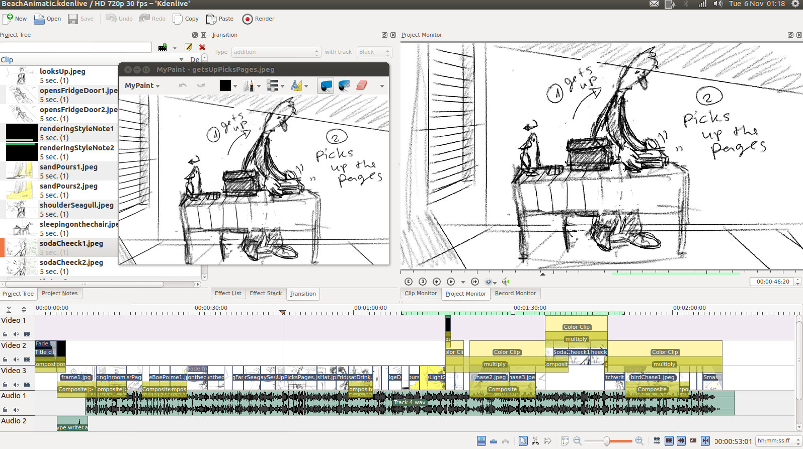
I used a combination of Kdenlive and Mypaint  this time around.
Kdenlive used to be quite unstable. But version 0.9.2 didn't crash once after hours of work.

The animatic took about 4-5 hours to make.
Some of the drawings are reused in multiple shots- retaining the framing of the camera, but moving the character around. That saved a lot of time too.


Soda trip - animatic from todor imreorov on Vimeo.


Concept art:
When designing the character, it's good to think about what you want to communicate with that to the audience. Who is that character and what are they all about? Does the character drive the plot, or is that character being driven by the plot?
How does the character fit with the rest of the style and what does that style say about the film?

I started with this basic sketch, which I am going to refine later on.


Anyway more on the character models and concept art in the next update!! :)

Thursday, February 10, 2011

my vector graphics workflow

I thought that the time is right to take a break from all this 3d business and talk about vector graphics.

So what is the deal with vector graphics and how do artists generally feel about it?

Vector graphics technology is used in industry alot, because of its infinite-resolution nature. Printing, animation, design, websites, etc etc. The data of the illustration is stored in mathematical (geometric?) equations. A lot like 3d technology (vertices), shapes are rendered with points (nodes). Every line is made out of nodes and every node contains spline data. The splines dictate what the line between the two nodes will be. In 3d technology, I guess when comparing it to the splines, you can say that vertex normals are kind of like that, because they dictate how the surface is going to be rendered inside the silhouette of the character.

vertices-->edges-->polygons--> a 3d character(mesh)
Nodes-->lines-->shapes/fills-->a 2d character/object


Read in more detail Here.

While different software has different advantages, the basic tools for doing vector art remain the same and in this article , I am going to share my workflow with you.


This picture took me about 3 hours

Why Inkscape and not illustrator?

Since I dont own a copy of illustrator on my laptop, I had to use inkscape, which is much like what gimp is to photoshop..


My work process:

1. Draw a rough sketch with the tablet:


So in this part, I just plugin my tablet and make a rough sketch of my robots. Vector graphics software has pressure sensitivity, but since it makes the lines as fills, its almost useless further on.


2. trace the lineart-


Then the next step for me would be to lock the sketch layer , create a new layer and start working on it. In order to see better, I make the sketch layer semi transparent. My fills are by default empty (no color), so whenever I close a shape, it doesnt cover the sketch with some color.

As you can see from the picture, I first put my nodes at the right places, while knowing exactly where nodes are needed. Then To get the shape right, I adjust their splines or just drag-bend the lines. It's very important not too put unneeded nodes, because that would slow down your work.
In many cases, some fills will have roughly the same shape and number of nodes as others, so I usually just duplicate whatever is possible and readjust the splines so it fits.

When Modelling characters or inking them, It's always good to be economical- use just the right amount of nodes/vertices.


3.Put some colors in the fills-

Next on, selecting all fills that will have the same color, I would give them color. Since I hate the dullness of the lines in vector graphics, I tend to keep them either very thin, or completely get rid of them. In this picture example, you will notice that the guy in the car has some lines, while the female robot has almost no lines. I did it this way, just to compare the two styles and think about how to get around the lack of lines. To me lines are just a way to define shape. But when the shape has color, we dont always need the lines. We need to add some shadows here and there to fill the gaps - her neck had to be separated from the head (as a shape), so I added a shadow gradient.Without the shadow, the head and neck both look very flat. One big disadvantage of not having lines is when your foreground object/character does not stand out from the background, which in some cases might have the same/close color. It does look kind of nice though.


So the way I add soft shadows and put some blending between colors in vector art, is by using either BLUR or GRADIENTs.
Blurring does make the file a bit heavier.

Certain colors go well with certain other colors. Colors can be used to set the mood of the picture, to lead the viewer's eye to something. It's generally a good idea to avoid having too many different hues in a picture- it gets too colorful, too distracting.

=================================
So what are the disadvantages for artists and why is it usually a bigger task to make something in vector, than it is to just sketch it?

If you look at it, vector technology is so much better than bitmap (pixels) because of the infinite quality pictures you get out of it. Why is it not used more than bitmap by artists? Well, the answer to that question lies within the process of how that is achieved and in the complexity of the task of vectorizing something like say a photograph of your granny.

In order to get a nice, smooth and polished picture, inside a file that is throughly well structured (easy to edit and reuse for other purposes) you need to do a lot more than just sketch it and then brush in some colors.

To structure it well, you need to build it out of closed fills and define their lines as well. Some of them can contain a pattern or a gradient. They can also be blurred or made transparent.
The more nodes you have on a fill, the more time you need to edit them in order to get the right shape.

One drawback that I believe has always kept artists from vector graphics for cartoon style is the lack of line thickness data type in the nodes. So lines in vector graphics dont have varied thickness. A line is as thick in the end, as it was in the start and the middle. In order to get that natural flow effect, and when drawing with a tablet in flash or illustrator, instead of lines the software creates fills for you. So your brush strokes are being stored as closed shapes instead of lines. That dramatically increases the complexity of your drawing- it makes it harder to edit. It kind of kills the usefulness of a tablet to ink a drawing in vector graphics.

Of course, you can simplify the shapes with a keyboard shortcut in the matter of seconds. All vector packages have a "smooth" command that will clean up some nodes.But that doesnt change the fact that lines are being turned into fills when you use a pressure sensitive tablet.

That has always kept me away from inking my own art in a vector package. The only times I have used Illustrator,inkscape or flash and need it to be in vector format was:
1.when doing design of Icons/software graphics on Vector linux (inkscape)
2. Building character libraries (flash/illustrator) for Scoyo(well, I did some) and my own short flash film from last year :D

There is also the vectorizing software, that would try and do all the tracing work for you. In most cases it does its job, though not perfectly. I would use an automated vectorisation only on clean black and white sketches. The best application for this task seems to be Vector Magic.

Sunday, October 24, 2010

Summer ends and project Piggy bank


Well, I worked all summer. No, it wasnt for a studio or anything like it. So I couldnt get more good stuff to put in my portfolio. So there is a lot of catching up for me to do now.


My 2d and 3d animation (malfunction and Stoneage) were shown at a couple of festivals, one of which the Moscow festival of Contemporary Animation . Unfortunately their website is in flash, so in order to see my entry, you need to go to English>Participant2010> and I am under number 44


EDIT: Just received a honorary letter from the general Producer of the festival.


And while being at it, here is a screenshot of the finalists page of CG coach awards, where you will find me listed. I am putting it on a screenshot, just in case they take the website down.


Second year of university started and I've been busy doing all sorts of class assignments. Somehow inbetween the whole chaos, there is still time for me to have fun with new software.

Let me first start with whats my homework for this semester. A 30 second (tops!) 3d animated film featuring a girl lifting a heavy object. I already had two storyboards which I was eager to do, but then a certain someone decided that students should have less choice. So the tutor gave me a list of types of characters and things they can possibly do.
This was the one that:
a) everyone else was not doing
b) tolerable (one of them "auditioning for x factor" urgh and they expect me to do it without any voice/sound)

So I picked the girl scenario and quickly scribbled this storyboard literally a couple of hours before the deadline:
https://docs.google.com/fileview?id=0B4WmGlTeh8z8ZTJhOTg1N2ItYjBmMi00MzRlLTgyM2EtNWQ1ZmY3NGE2ZTE3
I still feel that the ending is weak. Maybe I can change it somehow.

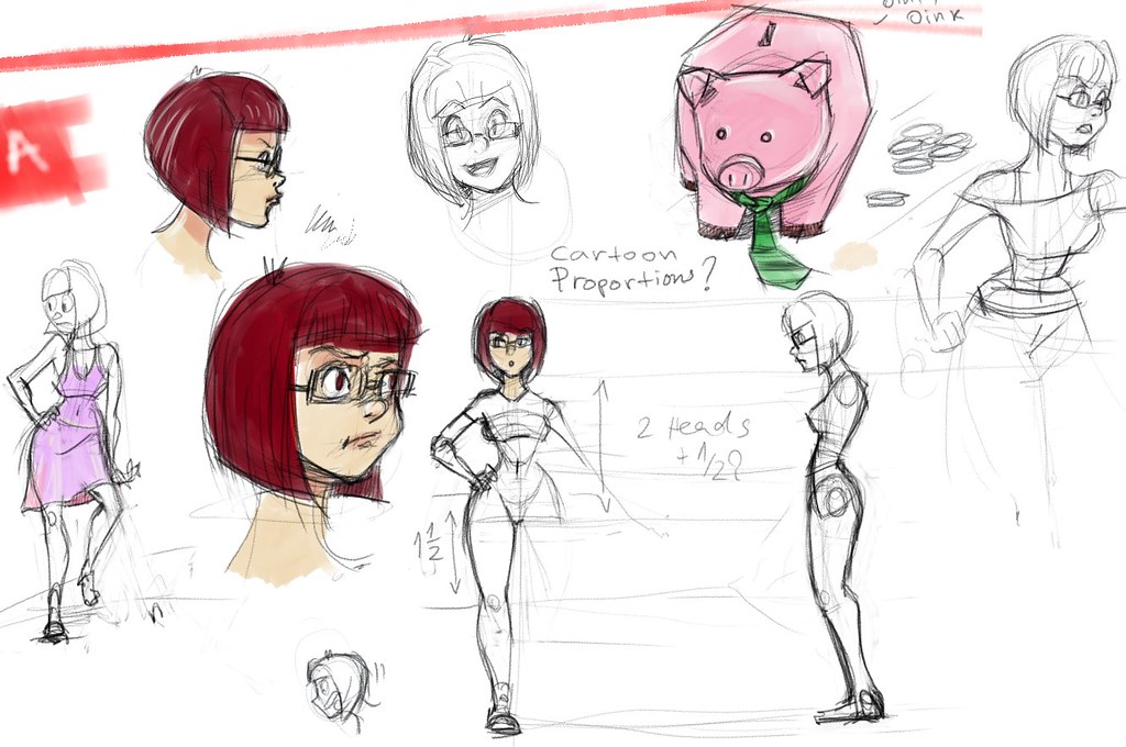
And here is the concept art that I made:


Made with my favorite open source painting app- Mypaint

And then I modeled the girl with zbrush, fixed her topology on the hands and added detail in Maya. The retopology tool in zbrush 3 would create holes in the area of the hands. So the easiest approach there is to just do the tricky parts in Maya or blender.

Next on is UV mapping and texturing. Since the character is with a cartoony design, I decided to avoid putting much realistic details. With 3d its very easy and tempting to make the model pointlessly detailed, but less can be more in this case. UV mapping and texturing was done in Blender 2.54 and took a couple of hours.

Blender-uvSeamsScreenshot

I decided to give the new Blender a try, because it has some tools that are better than Maya's at the moment. Uv unwrapping and sculpting mode are especially nice in blender. My hope to see a better sculpting mode in Maya is almost nonexistent since Autodesk also owns Mudbox and likes it when people keep buying it.:P So yeah, its also 0$. Of course it has some annoyances and quirks, but the more I use it the easier it gets. Texturing mode in blender lacks symetry, or at least I couldnt find it. Also pressure sensitivity for my tablet model didnt work, so I made the simplest most basic texture possible.

blender-polypainting

Her shape still needs some tuning. I will use belnder's sculpting mode to fix the hips/legs and head. I noticed that when I import it and soften the edge normals in Maya, her proportions look kind of different to the eye. That might need some adjusting too.

My goals with this animation are:
-learn Blender 2.5 and integrate it in the pipeline (70% done- I need to learn more)
-use maya dynamics - Maya hair or Maya cloth, but keep it very cheap on CPU/render time. Do that after the animation is complete.
Deadline is till the end of semester one. This new knowledge will help me create the next project- a storyboard that I've been working on for a while now.

Sunday, March 21, 2010

mammoth -the set up


I finished the Mammoth character set up yesterday and while skinning frustrated me at first, I managed to get it done way faster this time. Thanks to some help I got at university. I am getting a lot of valuable feedback from more experienced students at uni. Anyway, here are some shots I took yesterday:


There are several blend shapes used this time. I got some assymetrical face expressions controls on the brows and the cheeks put into single controllers.


I like having one control do as much as possible. That simplifies the work later on. These characters are far from perfect, there is still a lot to learn. But I guess that they will do for this animation short.