"Team Chameleon" was formed out of 5 people: 2 programmers, one graphics guy (me) ,a musician, and a level designer.
 You can play the game HERE in your browser.
And THIS is it's entry page- on the global game jam website.
Howto play the Demo:
Please note that the game doesnt have a loading screen yet, so you will need to wait a bit for the graphics to load from the web.
The astronaut can see in one of the 4 different color spectrums. Hit spacebar to switch between them and make their platforms visible. Also note that seeing in a color spectrum also makes you SEEN by the monsters that exist in that spectrum. The goal is to get to the bunker! :)
The game won us the industry game jam award- given to us by gameloft!

Organisation
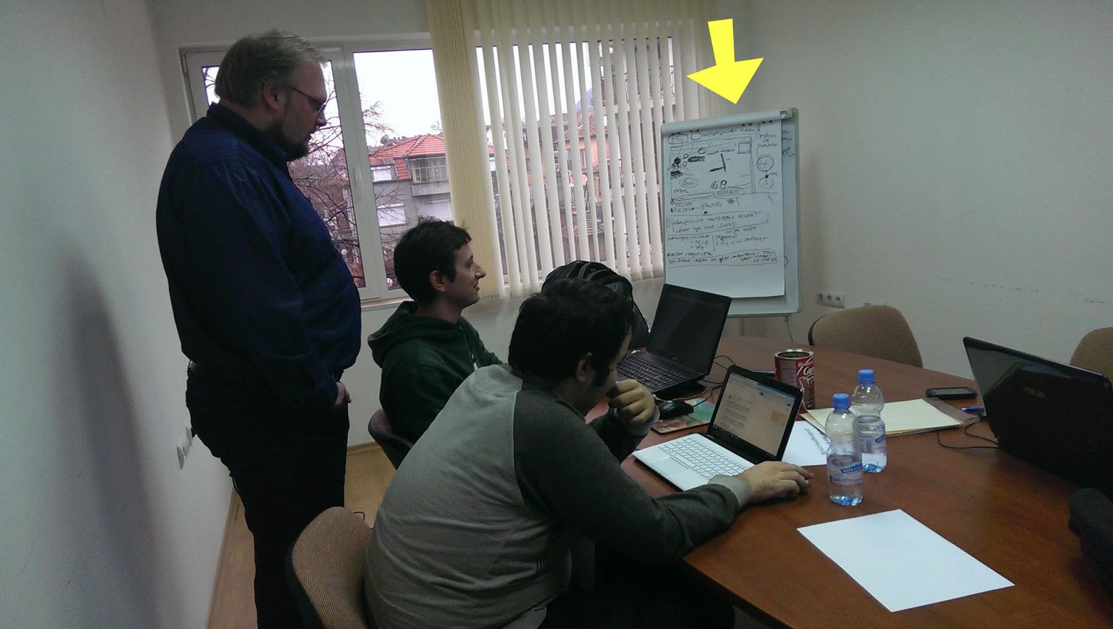 After the pitch was done, I got everyone on the team sit down together and flesh out the idea. We were 4 people in the room - having us all vote wouldn't have worked, so my involvement in this part was not to vote on ideas. Instead I sat outside the idea pool and acted as a mediator. I outlined our production plan on the white board -going through everything we need, see if everyone is on the same page and if not- let voting do the work. People brought up valid issues in the design and they voted on the best solutions - fleshing out the design. Would invincible platforms still act as platforms or not? Would invincible enemies continue to chase you while you don't see them? Is the outlined plan realistic for the 48 hours? What are our priorities- which features can be labeled as "extras"? What do the programmers need from me- the artist and from the rest of the team. What resolution would the game run in. How big is the sprite. And so on.
During the first day of the event, when the topic was revealed:
"We don't see what we see, we see what we are" (or something like that)
All I did was wonder around and try to get to know people in the room - find out what their take on the theme was and also to see if I can find some programmers.
The initial idea of the game is that we, as human beings have a limited perceiving of the world - for our eyes can not see the complete spectrum of light. This idea came to be after a chat with a color blind guy, whom I met at the event (what are the odds).
After finding 2 excellent programmers, or more like them finding me- we got together at the table and had to come up with a game pitch in less than 30 minutes!
For this part the best thing for me to do was to allow for everyone to shoot ideas and on my part-write them all down on a piece of paper and compile the pitch.
Some of the ideas were:
- Colored vs black and white
- Perceiving things in a wrong way (in different colors)
- Seeing only things in certain colors.
- Forcing the player to memorize where platforms are
- Point and click items in a room in a sequence - in order to proceed to the next room (puzzle)
- Platforming (voted on this - it's a popular genre that people understand)
- At the end of the brainstorming session I enforced on the team the need for antagonism. Memorizing platforms is not enough to keep the players on their toes. Thus enemies need to be hidden in every color spectrum.
After the pitch was done, I got everyone on the team sit down together and flesh out the idea. We were 4 people in the room - having us all vote wouldn't have worked, so my involvement in this part was not to vote on ideas. Instead I sat outside the idea pool and acted as a mediator. I outlined our production plan on the white board -going through everything we need, see if everyone is on the same page and if not- let voting do the work. People brought up valid issues in the design and they voted on the best solutions - fleshing out the design. Would invincible platforms still act as platforms or not? Would invincible enemies continue to chase you while you don't see them? Is the outlined plan realistic for the 48 hours? What are our priorities- which features can be labeled as "extras"? What do the programmers need from me- the artist and from the rest of the team. What resolution would the game run in. How big is the sprite. And so on.
While one of the event organizers told me that we are wasting time with this planning, I still believe that one hour wasted on planning saved us from several hours wasted in arguing and headaches. I have been through this with other teams in the past and I knew what a recipe for little disasters looks like. It's when problems are brought up really late during production!
---------------------------------------
Workflow
First of all, game jam is an event in which a team has to make a game in 48 hours. Since I was the only graphics person in the entire team, I had to choose my battles wisely.

It started with an animation pencil test (done in pencil2d) - so i can give something to the programmers early on- for them to test with and also for me to get an idea about sprite size. This would later determine the line thickness of the final sprite and also the detail design.
Next on I looked for inspiration from "The forbidden Planet" and other b-movie posters from the silver screen era of awesomely cheesy 3d movies.
And thus drew the initial background- as tall as the game resolution and as wide as I my heart desired (then cropped it).
Using Artrage- for it's natural media tools. Those helped me get closer to the poster vibe. Back in those days artists had no computers. I even faked some scratches on the paper and extra paper grain.

Having a BG tile lets me establish the overall color palette of the game - something that is a reference point when choosing colors for the player,platforms and enemy sprites - those need to stand out.
For the final sprite animations I used Toonboom studio. This allowed me to tweak colors and crispy line thickness. Finally- exporting to any size that my heart desires (or more like the programmers desire)- one of the greatest advantages of vectors.
Both the enemy and the player sprites are animated inside the same file- to save time and to have an easy way to compare them. The enemy design and coloring is inspired by a stylistic effect some pulp posters use - depicting it as a dark shadow with a detail defining neon rim light(s).

I managed to plan enough time for doing some 3 tone cell shading on the player sprite. The programmer required me to export both the player sprite and the enemy sprite in 4 different color mode versions.

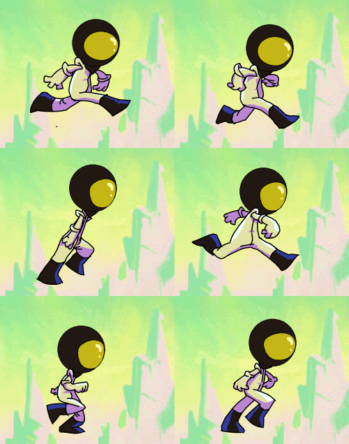
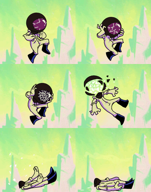
I know I could have done this as a cut out animation rather than inking all the frames. I chose to do it the proper way because setting up a cut out rig alone would have wasted that time anyway- the sprite animations are short so it wasn't worth it compromising their quality. If they were longer or the programmers needed it cut out for some procedural things- like armor swapping- then I would have had used "Spriter" instead of toonboom studio.
All this and much more was done in less than 48 hours!!!
Even managed to speedpaint a picture for the title screen during the last thirty minutes.
The title picture reuses the Planet graphic. There is the obvious mistake of having a different number of fingers. That index finger sure is crazy. But this is what generally happens after some sleep deprivation. :)
What didn't make the cut:
Our level designer kept insisting on having different backgrounds (suns) for each color mode. I resisted because it complicates the core "hook" of perceiving colors and it is also creating more work for me.
He also insisted on having cut scene drawings to tell a comedic narrative. While this was welcome by me since his ideas on those are really entertaining- I decided not to do it because things with more priority were not finished.
If we had more time I would have had the programmers change the font at the title screen, fixed the issues with my own half baked graphics, had insisted that platforms in the game are jump through type rather than solid, had insisted to place a different background for each level and a different music too (the musician made more than one tracks for the level) and many other things.
But this game is finished now and it's time to move on to better things. :)


