So my reaction naturally was to question the decision to put the layers inside the toolbar. And prompt the developers to consider using the N-panel instead. In order to make decisions like this fit well with the rest of the already established design, I took the idea even further and filed another UI proposal at the official wiki.
problems
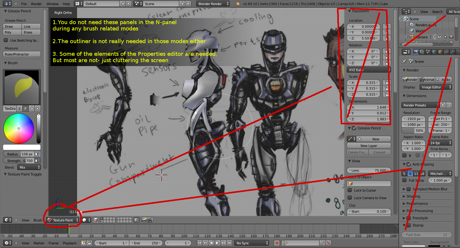
1. The current N-panel is showing irrelevant information to the editing mode that you are in (for most cases)
The N-panel editor in the 3d viewport always shows the same information/properties in all modes. As a result you get a lot of irrelevant stuff to scroll through in most editing modes. The user wouldnt need to alter the rotation or the translation of a mesh while working in texture paint mode for example. They wouldnt need to access the "Motion tracking" panel in most modes.
2. Screen Space ~
Blender's UI is currently not using it's screen estate very well. The interface is wasting space to display a lot of irrelevant information when the user is texture painting for example. The properties editor is rarely accessed to set a custom brush or do some other small thing. And since it requires effort to hide completely, it just sort of stays there most of the time.
The N-panel on the other hand is easy to toggle on and off. This is distracting to old users, steals valuable canvas screen estate (artists)
3. The interface makes you work ~
The user also has to manually navigate to the required tab in the properties editor and know where to find the feature that would aid their task.
4. The properties editor is not available in most of the other layout presets~
There are a few items in the Properties editor which the user has to access in other editor windows, such as the image editor for example. But the properties editor is not available in the uv unwrapping layout preset or the image editor. It takes a lot of horizontal space as it is wide.
It is not available in the texture editor window. The N-panel however is available everywhere!
solution

To solve a lot of this cluttered interface issue and also speed up workflow by reducing the need to deal with switching tabs in the properties editor and looking for stuff, Blender's N-panel can adopt some of the T-toolbar behavior.
It is already planned to get the tabs.
My suggestion is:
1. Make the N-panel sensitive to the editing mode that you are in- so it displays information/properties that are relevant to what you are doing. Just like the toolbar.
2. Since the N-panel already shows object properties (such as object coordinates in object mode), I don't see why we can't also move/duplicate some of the items in the properties editor to the N-panel. Everything in the properties Editor that is relevant to what the object mode needs needs to go to the N-panel's object mode.
We only need a few of the items that are found in some of the properties editor tabs.
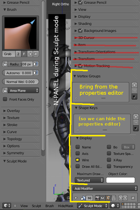
if we move/duplicate some of the properties panels to the N-panel, we will allow the users to entirely hide the big fat Properties editor and outliner while they are not needed.
Some examples of items that are in the Properties editor, and would be useful in the N-panel:
- n-panel in object mode: modifier stack,
- n-panel in texture painting: Materials and textures lists (to switch between and edit textures),Textures>brush type(to set new brush textures), Vertex groups list (for masking), UV maps list,
- n-panel in Edit mode: modifier stack, UV maps,
- n-panel in sculpt mode: modifier stack, Shape keys, vertex groups, Textures>brush type (to set new brush textures),
- n-panel in vertex paint mode: todo
- n-panel in Weight paint mode: todo
- n-panel armature - edit mode: todo
- n-panel armature - pose mode: todo
-The N-panel is not present only inside the 3d viewport. It is also available in the Image editor and other blender editors. So this design logic can be beneficial to all of blender's layouts.
Conclusion
As you can see from this mockup, with a bit of improvement on the N-panel, Blender can look much cleaner!
-It can be much more intelligent in guessing what you need depending on what you are doing and show only relevant information.
-The user gains a lot more screen estate for the working area.
- The overall interface design is more predictable and it fits with some of the already established design concepts.
-Improved full view mode workflow.
- The overall interface design is more predictable and it fits with some of the already established design concepts.
-Improved full view mode workflow.

Proposal 2 - Better GUI for animators.
Link to wiki here:
http://wiki.blender.org/index.php/Dev:Ref/Proposals/UI/Better_gui_for_animatorsOutlining the usual set up
You need to have your graph editor to control the spacing, you also need to be able to easily select controls visually - so a 3d viewport big enough for you to be able to rotate around the target character and select their controls. You need to have the N panel channel box- to see the values in their numeric form and change them. Finally- you need to have a constant look at the camera that the final render is going to use- this is particularity important not only for staging, but also the silhouette of the character. It's your end goal and as such it's what you should be constantly looking at when animating.
Now with all these things open- you need to set up your layout in something like this:

Whatever you resize will sacrifice something else. The most important screens you need to observe is the graph editor and the final render screen. When you make them too big, then its difficult to quickly and visually select controls of the character.
Picking controllers
First of all we can make selection of rig controllers much easier in blender and eliminate the need for a dedicate 3d viewport open simply to select them. Professional animation studios tend to use a "character controller picker". This is a 2d panel that is basically a button maker. It allows the animators to generate buttons that select the character controllers- lay them down visually - by moving them around in 2d space over a screenshot of the character. The picker eliminates the need to tumble and orbit around the 3d character to get to their controllers. Some times controllers get obscured because of the pose,other controls or background elements. They are too small or hard to get to. So this 2d button map makes it super easy and quick to select multiple controls and add a keyframe on them.

Blender does not have a picker. My suggestion is to get one made in a plugin form and include it in trunk. It can make use of the toolbar tabs too! It would be extremely helpfull
Graph editor- overlay mode
This is mostly a GUI issue when you have one monitor. Maya has this issue too. Blender however has a feature that can be advantageous for blender users- but it is not making use of it. It can potentially help the issue.
When you use the graph editor- you need to have more space- both vertical and horizontal. But when the graph editor is sharing it with all of the other layout windows- it gets really tiny. This creates the need to do more zooming in and out- vertically or horizontally depending on how the graph editor window has been deprived of space.
I personally have it a floating window in maya- so I can resize and move it. But then again- it obscures my visibility over the 3d viewport that way. And I find myself constantly moving it around and resizing it.
Some times (again in maya), I have it at the bottom half,with the top half being shared between controller selector on and the left and a render can on the right. This however squishes my graph editor- depriving it of vertical space.
What I figured is though- I do not need to have good visibility of my character's details while posing it and changing the spacing. All I need really is to have a good look over how the silhouette looks like. Additionally the graph editor has a lot of negative wasted space while you edit curves. I look at 1-3 or 4 curves at a time- usually close enough to have fine control.
Now this proposal might sound a bit crazy, but it is something I always wished I had in any 3d software. Its a way to have a good look over both the graph editor curves and the 3d viewport at the same time- without sacrificing size. Whats even better- the actual curves are visually close to the character- my eyes dont need to travel up and down the screen to compare their shape and placement to the way they are affecting the character's pose at the in between poses. So much less effort for me that way!
We can take advantage of using the semi transparency we currently have in order to create an overlay mode for the graph editor. What I mean by that is pretty much the ability to view your 3d viewport (with the end render cam) as a background in the graph editor! The graph editor can be like a semi-transparent overlay we can turn on and off in the 3d viewport- while we are in pose mode.

Or we can have this as an option inside the graph editor- similar to how the compositor works- the ability to show the 3d viewport behind the f-curves.
This in my opinion can be a convenient option for animators, who are sick of moving windows around and resizing layouts when working with the graph editor. No other software has done it in my knowledge so it might sound risky, but it really can be a killer feature for blender.
It’s an remarkable piece of writing in favor of all the web viewers; they will take advantage from it I am sure. Bye
ReplyDeleteRegard from young entrepreneurs
Tangki Fiberglass
Jual Septic Tank