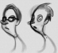
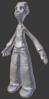
for the character design:
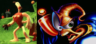
 I used to draw Klayman and Jim ALOT when I was a little kid - Even had a few fan made comics of Jim and Sonic. So the Dude is inspired by those characters to a certain degree. Being so, it was great for me to revisit them and see how they move - how the joints deform their mesh.
"The Dude" is a working name- reference to Big Lebowski.
- Achieve curvy line of action within the spine
- A silhouette that "flows", avoiding symetry and parallel lines, avoid mirror symetry as well
- appeal with directional force
 This guy was made with a skin modifier in blender, which is just like zspheres in zbrush. From there he was sculpted with dynamic topology on (it's much like what sculptris has), so I didnt have to worry about geometry and could focus on the shape and the design. Having the grease pencil allowed me to scrible over the mesh and sort of imagine how it would look like when I start to texture it.
The design from the sketch changed a bit in order to work better in 3d. I admit that the eyebrows area and the nose was a bit inspired by Aardman.
When you model characters it's definitely somewhat beneficial to have some rigging and skinning experience.I wrote some notes as to how they are going to deform. While modelling them, the topology and proportions were based on those notes.
It also became more and more clear what the rigs would need.
I write notes in a sort of a journal that is backed up on dropbox. But it's good to share some of the stuff with the world, to get feedback and keep it open.
Here are some notes on character modelling and the the neutral pose:
- Arms and legs should be slightly bent so the IK solver knows the direction.
- They should be bent only on one axis- if you bend the joint that the IK will affect on 2 axis, that forces the ik to slightly offset its original rotation during application.
- The spine sort of bends both positively and negatively from its original axis,and also on more than one axis, so it's easier if that geometry is not posed at all and remains straight before skinning.
- when you model the fingers, the legs and other parts that are close together, try to give them some space so you dont get joints from one limb affecting the geometry of other limbs
- Split parts of the geometry that don't really need to be skinned and you can just parent them to something- it will save your computer some cpu hopefully, but also reduce some of your workload. Keeping things simple when its possible.
- Give enough edgeloops for deformations to happen accordingly, dont place any poles where a character will likely deform visibly
On retopology:
The first thing I did was reuse the topology created by the skin modifier and clean it up from weird poles and weird edge flow.
The shrinkwrap modifier forced it to readjust itself to the tweaks I made during sculpting.I completely deleted the skin modifier's head geometry as its topology was a mess. It's often easier to start over than try to fix a mess.
The hands were an area that needed a considerable amount of cleaning up, eventhough the skin modifier gave a decent starting point.
Added nice bevels on his upper body to catch that highlight and give him that blocky hard edges look. I considered how he would deform and gave him enough edgeloops at the joint areas. Since he will have more of a 1920's cartoon rubber hose deformation on his limbs, I had to spread the loops a bit more there.
I tried to avoid adding topology where its not needed to define the shape, however that left some star shapes. It's generally a good rule to hide these poles where you would expect the model to crease anyway or areas where it won't deform much..
It's good practice to have an even number of vertices at edge loops of limbs that need to be closed (feet,fingers,etc). That doesn't count for loops that are in the middle axis, since by default the mirror modifier will multiply verts in middle loops by two (the neck,the torso,etc).
The face needed bevels to keep his "blocky" hard surface edges from the original design. This screenshot shows what I start with for a foundation when I retopo the head. Much like what many others do, I would first lay my edgeflow down and edgeloops. In this design scenario case one thing to consider again for his head was the bevels from his upper body continued on his face- to keep the blocky look from the original design.
He takes off his shoes during the beach part and the hair gets messier, his sleeves change too. For that reason I made an extra hair mesh to put on top of the tidy one.The shoes and sleeves are a separate mesh from the body so that is going to be replaced when needed. The head is a separate mesh too.
He takes off his shoes during the beach part and the hair gets messier, his sleeves change too. For that reason I made an extra hair mesh to put on top of the tidy one.The shoes and sleeves are a separate mesh from the body so that is going to be replaced when needed. The head is a separate mesh too.
For the Bird
I used a very similar approach.The design was researched - my journal contains a big number of bird pictures from google image search- pasted from clipboard straight into the notes. Asked some friends which one they like and number 2 came out as the favorite.
Wasn't completely sure how to do the neutral pose, as this is the very first time I do a bird. But we'll see how it goes when we get to the rigging stage.


No comments:
Post a Comment