nav2

Showing posts with label inkscape. Show all posts

Friday, May 13, 2016

Feature proposal - vector eraser that erases strokes up to intersections


Very often when cleaning an ink drawing, the artist will need to clean up line overshoots. A good example of this is hair, but it applies to many places in a drawing.
In vector software, we tend to favor line overshoots, because that way we know for sure that our shapes will be closed off and ready for the bucket tool.
The first time I see this idea applied in an open source project is in  OpenToonz - the 'Remove Vector Overflow' command. This is where this command is supposed to come in and save the day.
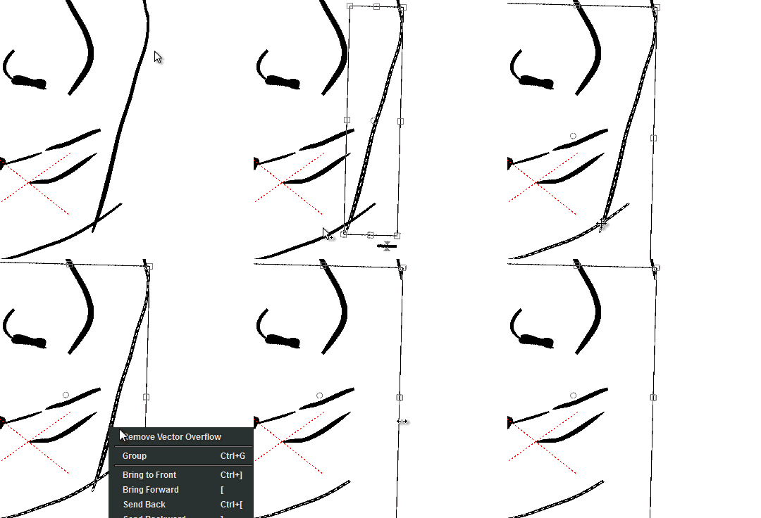
It however hardly works. Very often it does noting at all.In fact almost 80% of the time when you select two overshooting individual lines, nothing happens, or it erases parts of the lines you want to keep.
My suggestion here is to add two new modes to the eraser tool - when you are using it on a vector level. These two modes can already be found in other software such as toonboom, clip paint studio and last but not least - inkscape:

A. Erase up to intersection - This can be found in both Toonboom and clip paint studio. What it does is it erases the lines up to the intersection point - where they intersect with another line. Clip paint studio has it as an eraser tool mode and it works excellently.
Toonboom has two strategies to deal with this. One is the one clip paint uses. But as a second strategy - there is an option in the brush tool - to always create a new node where the stroke you drew overlapped another stroke. From there on it is easy to erase all the nodes exactly to that point and you dont need to move nodes around to get them to overlap. Another strategy with the brush tool is to automatically snap the beginning and end of a line to a closeby node of another line or the line itself (toonboom). Inkscape allows you to continue previously drawn lines - but unfortunately works at the end points of lines and is very limited.

B. Object mode eraser- very often the artist would require to erase entire strokes of a drawing - every stroke is a vector object. Right now in OT you have to go to the select tool, select the strokes and hit delete, then go back to the eraser tool to continue working. In inkscape the eraser tool can also erase entire strokes like this:
The implementation in OT almost never works in practice. It works when you draw a simple square, but when you draw a character and start trying it out - the one in clip paint does the job , while vector overflow in open toonz fails
I wonder how clip paint does it. It's the best one I've seen so far. Strokes there dont create nodes at intersections - so they must be somehow figuring out where the intersecting points are:
Here is my theory
--when the stylus starts a stroke in vector eraser mode:
1. Vector erase stroke collects a list of lines (like inkscape does in example B.) that you touched during the stroke.
--On release the following happens:
2. Instead of deleting the entire lines (which is an option also), it splits them all up at intersections points (cache result)
3. Using the result from step 2 , It marks the parts of the lines that your stroke has touched and deletes them
4. The lines that were split up (in step 2) are connected again
5. All the lines in the list of lines from step one are deleted and in their place are created the lines created by this operation.
To the user it looks like lines were deleted up to the intersection - just like it happens in the gif of example A .
Anyways, if i knew c++ i would have tried to figure out a way to make this. Hopefully a more experienced programmer will be interested.
So in order to implement a vector eraser mode that deletes lines up to intersections, you will first need to implement a mode in which it can collect a list of all the lines that it has touched.
You get two awesome vector erase modes in one!

Inkscape developers are much closer at achieving this tool, as they posses the main elements.
The default eraser tool mode already collects a list of lines that the stroke has touched.
The 'Cut Path' command can split a line where another overlapped it, it however deletes the line that overlapped it - which is something we do not want in this case!

Krita Developers - Are actually currently trying to collect funding via kickstarter to improve the vector tools in it. There is no statement made in the campaign that they are planning on adding such a mode to the vector eraser. It is not a stretch goal either. But in any case, I found out that some of them are quite aware of this tool in Clip Paint Studio. Whether we see it in Krita or not - only time will tell. It currently needs an entire rewrite of the vector system, but for that to happen they need your help:

If you haven't seen krita yet, feel free to give it a try. Downloads to the latest version are available at the kickstarter campaign page.

OpenToonz - The development of opentoonz is active as I write this, we will see if in the future they improve this feature. In any case, I filed it here #287 in their bug tracker.

Monday, February 16, 2015

Some hired work from the 2011 - graphics and mockups for tablet games

Back in 2011, I had the pleasure of signing up for a part time job with Cogworks studios  -as artist/animator . I made graphics and mockups for a bunch of iOS games/Apps. There was an opportunity to go full time, however I was in the middle of my second year at the University of Bradford - there were a lot of assignments stopping me from doing that. Also UK students are not allowed to work for more than 20 hours per week.


We used toggl to track my time each month. Sadly university took a lot of it and as you can see from one of my reports- I wasnt able to spend too much on concepts.

There was of course a non disclosure agreement with the job. Those type of agreements usually have a period of time - in this case 3 years - in which I am not allowed to release any information or show any of my work publicly. Well since 4 years passed I said to myself - What the heck, Let's do it. I am going to share with you some of the more fun ones. :)

Please note that some of these were quickly made sprites - used to put together a prototype for a few games. They were in no shape or form the final product. The names I am giving the games are not the final product names.

One of the projects was to do a game in a frame concept for Team 17. The deadline was very tight, so it's not very polished. I am not going to go into detail about the game ideas or design, since none of that was my work.

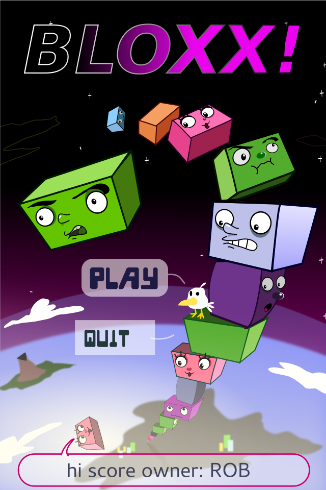
There was another ongoing project for a Jenga-like game where you stock blocks ontop of each other. I made a title screen, two backgrounds and animated sprites for the blocks. Each block had a face with a different character. Doing the backgrounds was really fun, since they were vertically very tall. We had a level where you stack blocks all the way into space, another one which started deep underwater and kept going until reaching the surface and so on. I had to use illustrator on that one, since it had better export tools.


There was a Bird in a factory game project where I made a number of bird concepts for. Then when we picked one of them - I made a fully playable animated sprite for the bird- run, idle, death, etc.
Some of the background elements also had to be animated - smoke, saw, travolator, etc etc. Those were simple enough to just do in Inkskape. I had set up for myself a script in linux that exports the svg layers as an image sequence. And another one which makes a gif file from the image sequence  (for presentation purposes). That saved a lot of time.

 I made an entire spritesheet in inkscape. There was no premade concept art, but the guys at Cogworks gave me some direction as to what animations they are going to need and some of the specific gameplay event items. I had some creative freedom in coming up with various hazards for the little bird though.

Overall these were fun projects for me and working with Cogworks was a real pleasure!
I do hope that they get to complete/release some of these games some day. Looking at my work from 4 years ago, I can't say that I am completely pleased with it. Surely it can do with a lot more polish! If these games ever get on production schedule, I would be more than happy to work on them full time.

Tuesday, February 19, 2013

d4i- Low poly stuff and using vectors to texture again

There is really no point in doing sculpting and retopology when the characters are really really low poly.

There is quite a lot I could get away with topology-wise, given that the shader is  to be shadeless and wouldnt have any normal maps - the only thing that has to work is the silhouette and the deformations.
The game engine triangulates the mesh, so I am allowed to use as many tris as I want to.
in order to preserve verts.
Instead of making uniform meshes, I would split a mesh into shells - to save on faces.

It took a few hours to get them from scratch to UV unwrapped stage. A nice thing about the mirror modifier in Blender is that it folds all symetric UV islands that its mirroring automatically when you apply it - one half over the other whilst putting the left side islands on top of their right side counterparts. This is not good if your model will use normal maps (as noted in a previous post in this blog), but its incredibly useful when you want to save UV space for obvious reasons. If you unwrap(again) after applying the mirror modifier, blender unfolds them in completely symetrical islands that are normal map friendlier. It's still very easy to later flip one half over the other if need be.

The shells are all uniform and no stretching for as long as you mark the seams right. Doing this is Maya is a hassle (without $$plugins??). Autodesk, please be more competitive and improve your uv unwrapper. :P

For the UV seams, I like placing those where I know a different colour/material of the character will begin. For example the snail's shell and skin would be on sepparate islands. This makes texturing easier later. I like cutting seams on the side of the character where I know the camera won't be looking.

Priority was given to UV islands that are going to have transparent sprites (bee wings, hedgehog spikes).
Islands that are on areas nobody will ever see (the mouth interior of the hedgehog or the bottom of the snail) I scaled down as much as possible - gave them very little uv space.
On top of that I used the snapping options to overlap identical uv islands (the bee's knees, legs,etc).

Next step , I exported the UV layouts and got them in inkscape, to be vectorised.

This splits the island shapes that were bleeding into each other. From there its a matter of Path>difference. 

This then gave me a nice and easy base colour for each island (picked it straight from the concept art).

Using vectors allows me to export it to any resolution, while having it small. Just as I did with the concept art, I decided to keep all of the enemy textures in one file, so it's easy to track if they are consistent in style, polish and execution. I used masking, clipping and other tools. New feature in inkscape 4.9 called "select same" allows you to select all objects with same fill colour, line colour, style, etc automagically. Useful when used with "union" to merge shapes, saves loads of time when colouring.

The three models can share the same material and therefore UV space. In total they are 685 faces (as you can see in the pic). I might have to add a few extra edgeloops on the snail's neck, might take out some geometry...


Tuesday, February 12, 2013

d4i - round 2 - Superfrog remake game for Team 17

This is for a group (team Stilton) project that I am part of in term 2 of my final year in University - design for industry module.
The goal is to recreate a 90ies classic platformer game by team17 and make it relevant in today's market. The name of the game is "Superfrog". The target platform is Iphone/android smart phones.

This is what we pitched to Team17, at their office:
It went very well. They were impressed by our progress so far and the approach we are taking.
 The presentation slides 13-21 are the ones that I worked on and presented.

A little disclaimer about the game:

It's merely a demo of the first level and a test to see how it works out as a modern remake. At this point, it's just an university assignment and a fan-made game.
Team 17 is awesome in a way that they will aid us with feedback.
Please note that I (and the others) have signed an NDA paper as well.

However, due to the nature of the legality of our university owning the demo, this game is likely to not be bound by secrecy. This can be very positive, as it allows us to seek the most hardcore superfrog fans out and get them involved!

We want to create something that not only pushes the graphics and makes it competitive/relevant today, but also keeps all the core ideas that hold a special place in people's nostalgic hearts.

It's going to be a brave remake that brings it back to life with a kick.
That means adressing the old art style, adressing the level designs, adressing everything - so its extra "Super" :D .

EDIT: Today Team17 announced and made it public that they are remaking Superfrog.
They did tell us that they are working on a remake at the meeting, but we did not see it. Our game is not to be confused with that, as it had no impact on the development of the official remake, nor did the official have impact on the development of team Stilton's superfrog.  I never saw the official concept art or assets while working on the art style guide and my concept art. Looking at the sprite, mine is very different in character design. They kept with the original more, while I used a number of tricks to make the character look more like a frog and sneak in some more superman references. It's a good thing that we didnt see how othe official one looks.

That said, we are NOT working on the official Team 17 game. It will be interesting to see how our game is different to theirs, as we take an alternative route. :)

 I was assigned as Art director and lead character modeller and animator  but also ended doing the majority of the concept art.
During the christmass break, I compiled an art style guide that looks into the graphics of different platformer games and reverse engineers their approach. It also contains a big number of changes that our game will have from the original.
Here is the WIP art style gide:


As work in progress, please note that it is going to change, new slides will be added, old slides might be removed or changed.  

Here are some of the pencil tests of run cycles I did for superfrog:


The concept art for the enemies:
I picked a number of the original enemies from the old superfrog (depending on how often they appear in world one and how much time it would take to animate- snail has no legs, bee doesnt walk, hedgehoog's knees are hidden). Using Artrage 3, made a quick concept drawing of some of these enemies and decided to model three of them.

And finally the concept art for the level itself:

To create that I decided to be a bit cheeky. The background (skybox) plate was drawn in artrage, then imported to inkscape.
The reason I chose to use inkscape(VECTORS) for the midground (and some of the BG that will paralax):
- It allows me to create clones of a single object. When I change the original, all of the clones update to accomodate the changes. This is very useful when you need to make the asset fit with the rest of the environment. It saves time!
- It forced me to be modular even in the way the level concept art is made.
- It helped me understand possible issues in art style when starting to put the assets in Unity. I numbered those issues and wrote them on a notes layer.
- Much smaller file (since its made of mostly clones of just a very few actual objects)
- Less destructive editing
- Helps me preview if a tiled texture is tiling well.
- This approach gives a nice and easy png files with transparency (grass strands) that are already named to export to a consistent directory.
- Textures and assets can be used in unity as placeholder graphics. The vector nature of the file means that the object size in the file is the size you get when you export, but that can be multiplied by the dpi factor and  give very crisp and clean images in any resolution due to pixel snapping.

I shared the source SVG file with the rest of the team to play with. Some of the team members expressed interest in using it as a starting point, others with no experience or desire for vector graphics decided to stick to photoshop.

The programmers on the team were able to put together a quick unity demo with the assets from my svg file for the presentation for Team 17. Experience in creating gameplay mockups at Cogworks and Disney interactive paid off!

I am sure that game designers would be smirking at the idea of putting a platformer style gameplay on a touch based device without buttons. Team stilton has come up with a number of ways to accommodate the limitations. We are going to take on that challenge. The game will hopefully have an online ( unity 3d engine) demo which anyone can play for free in their browser.

Monday, December 24, 2012

D4i-term1 - Car safety game for Himex

One of the final year modules of the University of Bradford is to work in a team (of 4-6 students) to deliver a product to a real client (with a deadline, for free).

The team that I joined is made of 6 people:
- 2 programmers.
- 3 environment artist/modellers/generalists.
- 1 animator/illustrator- me.

In this blog I have decided to (selfishly) write only about my own contributions to our projects.
This is to avoid any unconvenience on the other member's side - maybe they dont want me to say this or that. Also there is a lot to write and it's best to pick my battles when it comes to this blog. Posts are LONG as it is.Other team members have their own blogs and time to write.

We all did a BELBIN test before having permission to form a team.
My Belbin results (strengths that are also my weaknesses according to the test) gave out the impression that I am good at:


The Belbin team report had this to say for my role in the team:
"should do most of the problem solving or be responsible for coming up with any new
ideas and suggesting solutions to the rest of the team."

My technical role in the team is Illustrator,Animator, Character modelling.

As a start, my job was to design a T-shirt picture to be used to present our team.The idea of the shirt and branding is by the whole team :
I did this with inkscape, as usual. There was a limitation of the number of colours for printing

Produced a number of variations for the rest of the team to vote on. The catch phrases and the name (like a sir) were some of the other team member's ideas. We tend to end most of our presentations with a bad pun joke involving cheese. it's important to leave a smile there.
.
I was team leader during Term one, but I asked to step down from that position and focus on animation for term two. Leading a team can become stressful - I dont have the time and energy to do a great job at it, while also contributing so much to development. It doesnt really give you any power if thats what you think - a good team leader shouldn't force ideas but rather keep people on topic during the meetings, keep everyone heard and make sure that everyone is on track and knows what they're doing.


What the experience taught me is that a group leader is someone who is passionate about and good at organising other people. Someone who constantly keeps motivating others and reminds them where they should be at a given moment with their work.
So it was a tough job ,especially when there is no office place and everyone is just juggling with uni work.
In industry that person who organises things would be the producer. He or she would elect who should be in charge of what and keep everyone in line, keep communication between the people and so on.
Not a job for the ideas person.
The group leader should not be personally biased by ideas, but should make decisions based on what's best for the project and sometimes what would keep everyone happy.


There is also a lot of infrastructure organisation  that I really am not good at and other team members did instead of me.

So each term has one project. The project in term one was to deliver a game pitch to HIMEX - a car insurance company- for a game that brings awareness about car accidents. The target audience is young drivers. Teens. This is the client's brief.

Everyone in the team proposed a game idea. This is what I proposed initially - two ideas.
They were fed into a team discussion and everyone from the team added some really great ideas to make it more fun.
We decided that an IOS game will need simpler contros. I pitched for a pacman like design where the car moves indefinetelly by default and you turn left and right by timing your tap at the turns.

This is the second presentation we made...
Everyone had a say what goes on each slide, but we divided who does and presents each slide in the 15 minute slot.
The slides that are in GREY are the ones that I mostly worked on.They are half arsed because of me.

For the final presentation, we used Prezi.
I didnt do a lot on it, but gather images.Some things were changed for the game pitch, based on the team's decisions, a public questionaire of the target audience (over 80 people) and the client's feedback from the last presentation.A number of new devices were added to the game idea and some designs were removed.I presented the game pitch slide only.

The presentation was a success. The client just gave us a lot of praise and no critical feedback(alas).
It's in no way a complete design document and does have it's quirks, but what went in there as a pitch really left Himex impressed and "inspired" to make a game.

However, we are not going to be developing this game for Himex, because we already have Team 17 as a client for term2's design for industry project. But let's leave that for other posts when the subject has matured enough..:)

Tuesday, December 4, 2012

Some cartoon shading research


Why the long interest in cartoons?
A quick and cheap real time material, capable of pulling off a "cartoony" look would be useful to quickly show off models. It makes sense to apply a cartoon style rendering to a film/game that has cartoon style character designs to begin with. This style is still a niche that some titles have successfully exploited in order to stand out visually in the 3d crowd. It's a style that is quite popular on mobile games!

+ Cuts production time?
+  Cheap to render -even real time- can be used in both film and video games
+ Easy?
- Obviously fake
- Can look cheap if not done well. Technology alone doesn't necessarily pull of the great end look.

Lets look into some of the ingredients that can be used to achieve this look

Cell/soft Shading  
-We need to tweak or remove the falloff of a realistic shading to simulate the effect of cell shading. We can do this in a number of ways. Starting with a flat surface shader ("shadeless" in blender) will remove any realistic shading on the object.

By baking the shadows onto the texture- This seems to be a common method with low end games. Baking shadows on to texture is a common practice by AAA games too. They do that in a way that the player doesn't really notice it, as the technique (also known as Lightmap baking) is applied only to non-dynamic shadows that in theory don't need to change. Lightmaps are used to generate ambient occlusion maps, fake colour bleeding from light sources and bounce lights (global ilumination). Developers do that and many other things to optimise their levels, to squeeze more fps.

I made a kimba cartoon 3d fanart model to try this idea.

For the first time I did my 512x512 texture in inkscape. There are some great advantages in using vector software for cartoon styles- be it 2d or 3d. It's easy to tweak colours and curves without the need of a messy eraser,lasso-ing or millions of layers. You can also upscale your texture to any size you want. Its pixel precise and smooth. Every pixel counts.

For some cartoon character designs, it's better to use flat surface eyes (instead of spheres). I left space around the irises in the texture, making it possible to animate their movement by animating the UV.
But if I animate them, they will need to be on a separate uv map.

Depth map shadows can be useful to add to it
Depth map shadows are shadows cast by an object that interacts with a light source. They're cheap, but not completely realistic - lacking opacity/blur falloff calculation. These things can be procedurally faked with post effects.
I tend to avoid having these shadows as the default completely black. Its nice to give them some sort of a warm dark tone, possibly use a ramp, possibly set them to multiply and render them on their own render layer, so they are easy to tweak in post.


Matcaps
This is a very well known shading method to Zbrush users. Matcaps are a great way to get some material and light properties on your mesh- without the need to set up a light rig and tweak shader properties. Instead all that information is stored in a single image file. Map that file to the normals of your model and you get a sort of an overlay that fakes material properties and interaction with lights, based on the angle of the camera.

There is a number of ways one can create matcaps. I made three matcaps- the first one with inkscape, the second one with MaCrea and finaly the third one with blender's nodes.

Outlines can be generated by a matcap, but they don't work out as well as the other method. The matcap seems to be better suited for fake rim lights:

A rim light created by a matcap. As you can see coordinates are set to "normal", I toned down the color value (it acts as a sort of a layer transparency in this case) and set the material layer to "Multiply". This is how you get matcaps in Blender.

 --> 


To create the matcap for the rim, I took a soft outline matcap I made in Inkscape, inverted its value and set its layer to screen, so I can give that black color a bit of a warm brown hue. This avoids desaturation/ugly shadows.


+This is good when you want to quickly preview the mesh in a closer to rendering situation (zbrush).
+It can be used to produce a cartoon outline and at the same time things like a rim light, secularity and soft shading- its very easy to tweak those by editing a single matcap image file or combining multiple matcaps.
+Some video games have successfully used it to cheaply create unique visual styles.
-Looking at a matcapped model is like having your viewport camera be the lightsource.
It doesnt look as if you're rotating around an object, but more like the object rotating on a clay pottery table. This can throw off the audience if the camera is orbiting around the target.


Cartoon outlines (outlines)
Mesh clone + normals trick- This popular method ( almost sure that Okami and Zelda windwaker use it) works in most real time rendering viewports. I found it to be the easiest approach.
To get it, simply duplicate your mesh,  then give the copy any dark material (uv texture, matcap,solid black color,etc). Flip its normals. Scale all its faces along the normals (alt+s in blender) , so its slightly bigger than the mesh- this also controls the global line thickness.

Tweak the outile mesh with your sculpting tools. The grab and smooth brushes are surprisingly good at manipulating the amount of outline, depending on the angle..

You can do this same thing with the solidify modifier if you're too lazy ;)

--disadvantages: Dublicating the mesh doubles the polycount, hence processing power. It also introduces the complexity of linking it to the character mesh. This should be done procedurally to avoid headaches when dealing with blendshapes. Perhaps doing a weird mesh proxy trick? I'll let you know if I find out.


Cartoon lines and shading can also be achieved by using the z-buffer pass ,the normal pass, and other passes - run those through a node tree and create the effect in post.
There is a lot more written on the topic here
My biggest issue with that can be
- Lack of full control over specific lines/shadows
- Lack of interactive feedback when tweaking values- freestyle render engine for example still needs to render out an image to show the lines. It would be best if it could update and preview in the opengl display.


Thursday, February 10, 2011

my vector graphics workflow

I thought that the time is right to take a break from all this 3d business and talk about vector graphics.

So what is the deal with vector graphics and how do artists generally feel about it?

Vector graphics technology is used in industry alot, because of its infinite-resolution nature. Printing, animation, design, websites, etc etc. The data of the illustration is stored in mathematical (geometric?) equations. A lot like 3d technology (vertices), shapes are rendered with points (nodes). Every line is made out of nodes and every node contains spline data. The splines dictate what the line between the two nodes will be. In 3d technology, I guess when comparing it to the splines, you can say that vertex normals are kind of like that, because they dictate how the surface is going to be rendered inside the silhouette of the character.

vertices-->edges-->polygons--> a 3d character(mesh)
Nodes-->lines-->shapes/fills-->a 2d character/object


Read in more detail Here.

While different software has different advantages, the basic tools for doing vector art remain the same and in this article , I am going to share my workflow with you.


This picture took me about 3 hours

Why Inkscape and not illustrator?

Since I dont own a copy of illustrator on my laptop, I had to use inkscape, which is much like what gimp is to photoshop..


My work process:

1. Draw a rough sketch with the tablet:


So in this part, I just plugin my tablet and make a rough sketch of my robots. Vector graphics software has pressure sensitivity, but since it makes the lines as fills, its almost useless further on.


2. trace the lineart-


Then the next step for me would be to lock the sketch layer , create a new layer and start working on it. In order to see better, I make the sketch layer semi transparent. My fills are by default empty (no color), so whenever I close a shape, it doesnt cover the sketch with some color.

As you can see from the picture, I first put my nodes at the right places, while knowing exactly where nodes are needed. Then To get the shape right, I adjust their splines or just drag-bend the lines. It's very important not too put unneeded nodes, because that would slow down your work.
In many cases, some fills will have roughly the same shape and number of nodes as others, so I usually just duplicate whatever is possible and readjust the splines so it fits.

When Modelling characters or inking them, It's always good to be economical- use just the right amount of nodes/vertices.


3.Put some colors in the fills-

Next on, selecting all fills that will have the same color, I would give them color. Since I hate the dullness of the lines in vector graphics, I tend to keep them either very thin, or completely get rid of them. In this picture example, you will notice that the guy in the car has some lines, while the female robot has almost no lines. I did it this way, just to compare the two styles and think about how to get around the lack of lines. To me lines are just a way to define shape. But when the shape has color, we dont always need the lines. We need to add some shadows here and there to fill the gaps - her neck had to be separated from the head (as a shape), so I added a shadow gradient.Without the shadow, the head and neck both look very flat. One big disadvantage of not having lines is when your foreground object/character does not stand out from the background, which in some cases might have the same/close color. It does look kind of nice though.


So the way I add soft shadows and put some blending between colors in vector art, is by using either BLUR or GRADIENTs.
Blurring does make the file a bit heavier.

Certain colors go well with certain other colors. Colors can be used to set the mood of the picture, to lead the viewer's eye to something. It's generally a good idea to avoid having too many different hues in a picture- it gets too colorful, too distracting.

=================================
So what are the disadvantages for artists and why is it usually a bigger task to make something in vector, than it is to just sketch it?

If you look at it, vector technology is so much better than bitmap (pixels) because of the infinite quality pictures you get out of it. Why is it not used more than bitmap by artists? Well, the answer to that question lies within the process of how that is achieved and in the complexity of the task of vectorizing something like say a photograph of your granny.

In order to get a nice, smooth and polished picture, inside a file that is throughly well structured (easy to edit and reuse for other purposes) you need to do a lot more than just sketch it and then brush in some colors.

To structure it well, you need to build it out of closed fills and define their lines as well. Some of them can contain a pattern or a gradient. They can also be blurred or made transparent.
The more nodes you have on a fill, the more time you need to edit them in order to get the right shape.

One drawback that I believe has always kept artists from vector graphics for cartoon style is the lack of line thickness data type in the nodes. So lines in vector graphics dont have varied thickness. A line is as thick in the end, as it was in the start and the middle. In order to get that natural flow effect, and when drawing with a tablet in flash or illustrator, instead of lines the software creates fills for you. So your brush strokes are being stored as closed shapes instead of lines. That dramatically increases the complexity of your drawing- it makes it harder to edit. It kind of kills the usefulness of a tablet to ink a drawing in vector graphics.

Of course, you can simplify the shapes with a keyboard shortcut in the matter of seconds. All vector packages have a "smooth" command that will clean up some nodes.But that doesnt change the fact that lines are being turned into fills when you use a pressure sensitive tablet.

That has always kept me away from inking my own art in a vector package. The only times I have used Illustrator,inkscape or flash and need it to be in vector format was:
1.when doing design of Icons/software graphics on Vector linux (inkscape)
2. Building character libraries (flash/illustrator) for Scoyo(well, I did some) and my own short flash film from last year :D

There is also the vectorizing software, that would try and do all the tracing work for you. In most cases it does its job, though not perfectly. I would use an automated vectorisation only on clean black and white sketches. The best application for this task seems to be Vector Magic.