One of the greatest advantages of open source is it's community driven culture. Those who use it also design it- everyone can contribute to the source code. And hey, if you are not a programmer, you can make suggestions and mockups at the forum. And if your ideas are good, somebody will pick them up. In this blog post I want to look back at my history with those sorts of interactions with the open source community. This will hopefully stand as an example of how fun it can be to be a user of free open source software and a part of it's community!
Vector linux
 Some time in 2006 I started using Vector Linux- a Canadian slackware based distribution. It's wonderful speed and clean design was a perfect replacement of the ugly/slow windows xp that my old computer choked on. It looked better and worked faster than windows 7. It was good, but wasn't perfect - I am not easily pleased. So I contributed directly to it by:
- Compiling and building packages for software that wasn't available at the repository
- Reporting bugs
- Making desktop wallpapers (embarrassingly ugly ones too :D)
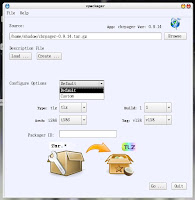
-And finally making icons and mockups for an in-house app for building packages, called Vpackager. This is sort of the first time that I can remember doing any interface related work.
Mypaint
I have been actively proposing features at the forum and the wiki, ever since the early days. These are generally in the form of UI mockups and descriptions.
One successful proposal I made was on top panel widgets- for recent brushes and recent colours.Also right side buttons to toggle on/off the side panel.
Today this is (sort of) how mypaint works like. It has a top panel with brush widget button and a color widget button, among other widgets. The developer took the idea and implemented it in a more polished design - he combined the recent brushes with the available brushes list. Also the recent colors with the current color selection dialogue - in one widget. That is even better than my proposal! He also took the side panel toggle buttons idea! How great is that :D
Pencil animation wake up call
Pencil animation is one of my favorite pieces of software for animation pencil tests. It's available for linux,windows and mac. However it is an unfinished piece of software - lacking many basic features that are much needed to save time on workflow.
One of the reasons for that was the main developer who left at one point. The code base got old and difficult to compile and maintain on newer versions of linux. In fact- almost impossible to compile. It was dying!
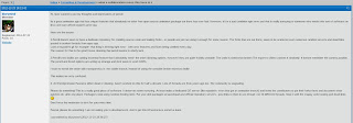
So, I made a new thread at the community forum- explained why I think pencil has become abandonware and also prompted the main devs and moderators on the forum to explain some of the history of this downfall a little bit more.

What this post caused was a wake up call. It might have been something that was going to happen anyway, but to me at least it seemed that the post outlined goals for the rebirth of pencil. Proposed not only by myself, but by those who have experience in development and know the codebase to some level.
It triggered more developer notice in the open source community, with LWN website using it as a reference to spread awareness on the issue!
Pencil animation was then renamed to pencil2d. The new devs are doing a wonderful job now. It has some much needed features - a better onion skinning to name a few. If you would like to support the work on it, please share the website with your friends, make something with it and share it, or donate.
Blender Interface - Andrew Price UI fiasco, putting down the fires!
Some time in 2013 Andrew Price made a controversial UI-remake proposition that set the entire Blender community on fire! His name was popping on every single post in threads that are not even related to Blender's UI. While he successfully outlined valid issues with the current interface, the proposed solutions were not ideal for anyone with any experience in blender or 3d software.
The blender developers were under a lot of stress, with a mass of people (mostly new to Blender) demanding a complete rewrite of blender's current UI or even worse- a new fork of blender with Andrew's interface.
In the case of Pencil animation-a zombie project- the fork was the only way to continue it's life. With Blender however, a fork can seriously damage it's currently wonderful active development health.
So I started a new thread at Blender Artist - asking those who are pro Andrew's proposal to outline in bullet points what it adds to the current design. Those who are against it- again in bullet points- state concerns over the proposed design.
And to my surprise- actual interface developers and some of blender's main code maintainers replied in it.
In general it became clear that the interface proposal is under-baked, but also that Andrew had valid points that developers should address.
I made some suggestions in the thread- instead of redesigning the current GUI , try to build on top of the design elements that do work. Address the standing issues by looking into how other software has solved them. At that point I made a proposal to look at Modo's tabbed layout interface. Start using tabs in blender's toolbar- so tool icons are not a scrollable moving target. Start using tab buttons to switch to different workplace layout presets. Make the actual tab buttons we currently have look more like tab buttons.
The devs are now working on a tabbed interface proposal here. This might become available in the future in trunk if everything goes well.
The outcome:
Andrew Price came clean and said that his proposal should be revised. His whole presentation is all about what he learned from the experience and what he got wrong.
Then Brecht himself came out and spoke about the existing problems with the UI. He identified all the problems we've been noting in the thread.
Ton explained how the foundation feels about it too- He patiently explained why a complete interface rewrite is a terrible idea.
If Andrew did something well, it's stirring things. The foundation formed a UI team and is now working on improving the UI in blender.
Blender interface mockups- GUI designs and suggestions
 Seeings at to how now there is a GUI team, I decided to continue contributing with mockups and suggestions at the official WIKI.
Here are some of the ones I have made so far:
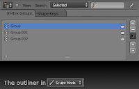
*The mode sensitive tabbed outliner , which includes:
-The merge of the materials and textures lists
-Some changes to the properties window
*Asset manager - an easier way to manage reusable resources in blender.
And finally
*First time user splash screen.


Blender is a awesome software I've used in ubuntu to create some 3D models and its the legit replacement for bulky 3D studio max. I use slightly different UI mockup software for these kinds of mocking ups. Thanks for the posting this!
ReplyDelete