So what is the deal with vector graphics and how do artists generally feel about it?
Vector graphics technology is used in industry alot, because of its infinite-resolution nature. Printing, animation, design, websites, etc etc. The data of the illustration is stored in mathematical (geometric?) equations. A lot like 3d technology (vertices), shapes are rendered with points (nodes). Every line is made out of nodes and every node contains spline data. The splines dictate what the line between the two nodes will be. In 3d technology, I guess when comparing it to the splines, you can say that vertex normals are kind of like that, because they dictate how the surface is going to be rendered inside the silhouette of the character.
vertices-->edges-->polygons--> a 3d character(mesh)
Nodes-->lines-->shapes/fills-->a 2d character/object
Read in more detail Here.
While different software has different advantages, the basic tools for doing vector art remain the same and in this article , I am going to share my workflow with you.

This picture took me about 3 hours
Why Inkscape and not illustrator?
Since I dont own a copy of illustrator on my laptop, I had to use inkscape, which is much like what gimp is to photoshop..
My work process:
1. Draw a rough sketch with the tablet:

So in this part, I just plugin my tablet and make a rough sketch of my robots. Vector graphics software has pressure sensitivity, but since it makes the lines as fills, its almost useless further on.
2. trace the lineart-

Then the next step for me would be to lock the sketch layer , create a new layer and start working on it. In order to see better, I make the sketch layer semi transparent. My fills are by default empty (no color), so whenever I close a shape, it doesnt cover the sketch with some color.
As you can see from the picture, I first put my nodes at the right places, while knowing exactly where nodes are needed. Then To get the shape right, I adjust their splines or just drag-bend the lines. It's very important not too put unneeded nodes, because that would slow down your work.
In many cases, some fills will have roughly the same shape and number of nodes as others, so I usually just duplicate whatever is possible and readjust the splines so it fits.
When Modelling characters or inking them, It's always good to be economical- use just the right amount of nodes/vertices.
3.Put some colors in the fills-

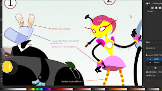
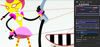
Next on, selecting all fills that will have the same color, I would give them color. Since I hate the dullness of the lines in vector graphics, I tend to keep them either very thin, or completely get rid of them. In this picture example, you will notice that the guy in the car has some lines, while the female robot has almost no lines. I did it this way, just to compare the two styles and think about how to get around the lack of lines. To me lines are just a way to define shape. But when the shape has color, we dont always need the lines. We need to add some shadows here and there to fill the gaps - her neck had to be separated from the head (as a shape), so I added a shadow gradient.Without the shadow, the head and neck both look very flat. One big disadvantage of not having lines is when your foreground object/character does not stand out from the background, which in some cases might have the same/close color. It does look kind of nice though.

So the way I add soft shadows and put some blending between colors in vector art, is by using either BLUR or GRADIENTs.
Blurring does make the file a bit heavier.
Certain colors go well with certain other colors. Colors can be used to set the mood of the picture, to lead the viewer's eye to something. It's generally a good idea to avoid having too many different hues in a picture- it gets too colorful, too distracting.
=================================
So what are the disadvantages for artists and why is it usually a bigger task to make something in vector, than it is to just sketch it?
If you look at it, vector technology is so much better than bitmap (pixels) because of the infinite quality pictures you get out of it. Why is it not used more than bitmap by artists? Well, the answer to that question lies within the process of how that is achieved and in the complexity of the task of vectorizing something like say a photograph of your granny.
In order to get a nice, smooth and polished picture, inside a file that is throughly well structured (easy to edit and reuse for other purposes) you need to do a lot more than just sketch it and then brush in some colors.
To structure it well, you need to build it out of closed fills and define their lines as well. Some of them can contain a pattern or a gradient. They can also be blurred or made transparent.
The more nodes you have on a fill, the more time you need to edit them in order to get the right shape.
One drawback that I believe has always kept artists from vector graphics for cartoon style is the lack of line thickness data type in the nodes. So lines in vector graphics dont have varied thickness. A line is as thick in the end, as it was in the start and the middle. In order to get that natural flow effect, and when drawing with a tablet in flash or illustrator, instead of lines the software creates fills for you. So your brush strokes are being stored as closed shapes instead of lines. That dramatically increases the complexity of your drawing- it makes it harder to edit. It kind of kills the usefulness of a tablet to ink a drawing in vector graphics.
Of course, you can simplify the shapes with a keyboard shortcut in the matter of seconds. All vector packages have a "smooth" command that will clean up some nodes.But that doesnt change the fact that lines are being turned into fills when you use a pressure sensitive tablet.
That has always kept me away from inking my own art in a vector package. The only times I have used Illustrator,inkscape or flash and need it to be in vector format was:
1.when doing design of Icons/software graphics on Vector linux (inkscape)
2. Building character libraries (flash/illustrator) for Scoyo(well, I did some) and my own short flash film from last year :D
There is also the vectorizing software, that would try and do all the tracing work for you. In most cases it does its job, though not perfectly. I would use an automated vectorisation only on clean black and white sketches. The best application for this task seems to be Vector Magic.
No comments:
Post a Comment