nav2

Showing posts with label gui. Show all posts

Thursday, April 9, 2015

3d viewport preview in the Graph Editor feature has arrived to Blender

A GUI/Animation feature proposal that I made a while ago has found it's way into the Gooseberry blender branch. You can see my mockups and the proposal right here:
http://imovethings.blogspot.com/2014/03/blender-ui-design-proposal-mode.html

I submitted it roughly a year ago to the blender dev wiki:
http://wiki.blender.org/index.php/Dev:Ref/Proposals/UI/Better_gui_for_animators

This was the mockup:
And this is the implementation that JulianSeverin made!

You might notice that the implementation is lacking the 2d controls picker. While this is still a feature that is not yet in blender trunk, some of the gooseberry dev videos suggest that the team is indeed interested in using a 2d picker in production and has even implemented something specifically for the project.

To further improve the Graph Editor, I also made a new mockup suggestion that would give us a better layout that is more consistent with the design of the outliner and is also much easier to understand:
of course this would make more sense in the dope sheet as well:

The mockup is also consistent with another feature request that I made a while ago - Auto focus curves of selected channels
This really goes to show that the blender development team listens to the community and indeed works to improve the workflow. If you have a proposal that is good and others like too, they might indeed make it happen!

It is worth noting that after I made this design proposal, an interesting piece of 3d animation software also made use of it.

akeytsu teaser from akeytsu on Vimeo.
Akeytsu's author contacted me a while ago, after seeing some of my posts at Blender artist. He is quite a nice guy and the software really adds value to the workflow that no other app has. I really did suggest that feature long before Akeytsu was announced, so I can assure you that Blender is not ripping off anyone. :)
That said, it is quite possible that he came up with the idea independently. It is beautifully implemented in Akeytsu!

One feature that I really hope to see in blender is the ability to clone/instance an f-curve. This could be done non-destructively via a "mimic channel" modifier. If we had that, we could for instance clone the animation of the left leg of a character and apply it to the right leg - flipped and with an offset. From there on any edits we do to the left leg would get applied to the right leg automatically.
With that modifier and with an operator, copying and ofssetting animation from one half of the body to the other can be done with a single click, cleanly and non-destructively. It's a feature that even maya doesnt have. Read more about the proposal at Blenderartist.

Wednesday, March 11, 2015

Some design proposal I made recently on open source projects

It's been a quiet month for me. You can say that there has been some progress on a personal game project I am working on.

Blender - getting auto focus curves of selected channels and auto-hide unselected channels functionality
Meanwhile the thread I started at blender artist proposing better workflow for animators has grown into something productive.
Severin has implemented one of the features that I proposed. it got a lot of support from another ex-Maya animator Fahr.
The feature is to add the "Auto-focus curves of selected channel(s)"  functionality in blender. It works like this:

1. First you enable it from the "view menu" (new entry)
2. Then you get this new behavior. Every time a channel or multiple channels are selected, Blender auto-focuses their curves.
The other ex-maya animator Fahr also requested that we add to the feature another useful behavior from Maya and some other 3d software- The ability to also "auto-hide unselected channel curves".

You see Blender by default makes the user manually hide the channel curves they dont want to see. As a result by default it shows all channel curves and you have to do a lot of manual clicking if you want to only see the channel curves that you are working on. When other channel curves are visible, they get in the way because you can accidentally select another curve or its keyframe while working. It also creates a lot of frustrating visual clutter in the graph editor. In contrast Maya shows only the curves that are of the selected channels.

So what happened was that Severin actually implemented those two features as one. 
You can grab a blender build and try it out for yourself here:
Testbuilds:
I proposed some changes of course:
The patch was however met by a lot of opposition from two die hard blender animators/developers. I suggested that we split this into two auto-view features that are optional. And what ensued was a long conversation that turned the proposed new feature patch into a design task.

Two ex Maya, now blender animators (me and Fahr) are trying to convince two Blender developer/animators (Cessen and bassamk) that if the feature is not implemented as a workflow mode, it will loose a lot of it's convenience and usability.
It seems like the argument is mostly on the "hide unselected channels" part of the feature and how that is being triggered.
Their stance on the subject is that:
  • It is cluttering the view menu - it is already cluttered enough already!
  • It's not their preferred way of working , but they see some merit in it.
  • it might confuse some users who enable it by mistake- as it changes the show/hide behavior of the software- merging selection of channels with their visibility toggle switch.
--a proposal was made to make this work by holding a modifier key each time when clicking on the view icon rather than the channel name to trigger the hiding of other channel curves and the focusing on the selected ones.
Our stance is:
  • The view menu should be cleaned up anyway with nested menus. This should not be a reason to complicate its design so much.
  • We are confused as to why there is so much opposition, since it does not nullify their preferred workflow at all. It is optional.
  • We firmly believe that this is not a problem, since it is already done that way in other software and is even a preferred way of work to many animators who are converting to blender. Since it is not going to be the default behavior, the user will need to toggle it on and it's name is self explanatory and clear enough to communicate to the user what is being enabled.
    • Both me and Fahr strongly oppose that proposal to changes in the design since it makes our proffered way of working very inconvenient as compared with how it is done in other software and was originally done in the initial patch.
      • It enforces the need to hold a modifier key each time, which gets even more convoluted when you want to apply the behavior on multiple channels- holding multiple modifier keys to do it.
      • To add to this, the proposal to click on the "view" icon rather than the channel itself also reduces the clicking pixel space.
Trying to salvage what we have, and following on a suggestion from blender artist I proposed that we add both the auto-view behaviors and also have the same functionality triggered by holding a modifier key (as Cessen and Bassamk suggested). If you are an animator using blender and have in the past used Maya, surely you know why this feature is extremely useful and why forcing a modifier key would mean that it is no longer automatic. If so, please take the time and write down what you think at the blender artist thread. We need suggestions as to how to solve this problem.

Sometimes politics is part of it and you have to be careful. For example if you post any links to videos showing how a feature works in another 3d package, that is met with a lot of disapproval on the blender bug tracker. They take it as a literal request to make blender be like the other software. Instead what needs to be the case is explaining why feature X and Y is very useful and why it makes other software a better tool for the job. I tried to do that and it didn't seem to change their minds. 

Solution to the fake user problem with Actions
At least that is something that I managed to get Aligorith to address and change with a lot of help from the blender artist community and some of the other blender developers. So in the end, blender devs do listen to their userbase. Even if we tend to get annoying and melodramatic at the forum some times. :)


X-sheet dock design - an alternative way to manage layers. Layer tagging 

Now moving on, here is another wild proposal I made to both Drawpile and Mypaint developers.

I took the time to create a quick mockup and explanation as to how it could work:

Under the hood x-sheet dock is just managing the same layers that are in the layer's dock. It's just doing it in a radical new way!
key pose drawings can occupy frame ranges. So When you extend a drawing to occupy three frames instead of one, the x-sheet dock technically creates two new copies/clones of that layer above or bellow it (depending on which of the two arrows the user dragged)
when playing from xsheet, mypaint can operate in solo layer view: like the "hide" feature, but hides all other layers except the selected one.
Onion skin mode: hide all layers above the selection and show the ones below it with adjusted opacity
The ability to scribble annotations is very very nice, but not a must have.
Copying and pasting+insert drawings could be done with the right click menu.
Deleting a drawing should move all the drawings bellow it upwards- filling its spot, so as not to have a missing drawing in its place.
moving a drawing in the x-sheet could be done by just dragging it.
Other features needed:
Export to animated GIF
Export individual layers (this already exists in a way: ORA files are actually zip files containing the >layers in PNG format)

In any case, I always find it fun to make proposals to open source projects. More often than not it is very important the way you make it. Having a mockup certainly helps a lot to communicate the ideas. Having other software case examples does as well. 

Friday, March 21, 2014

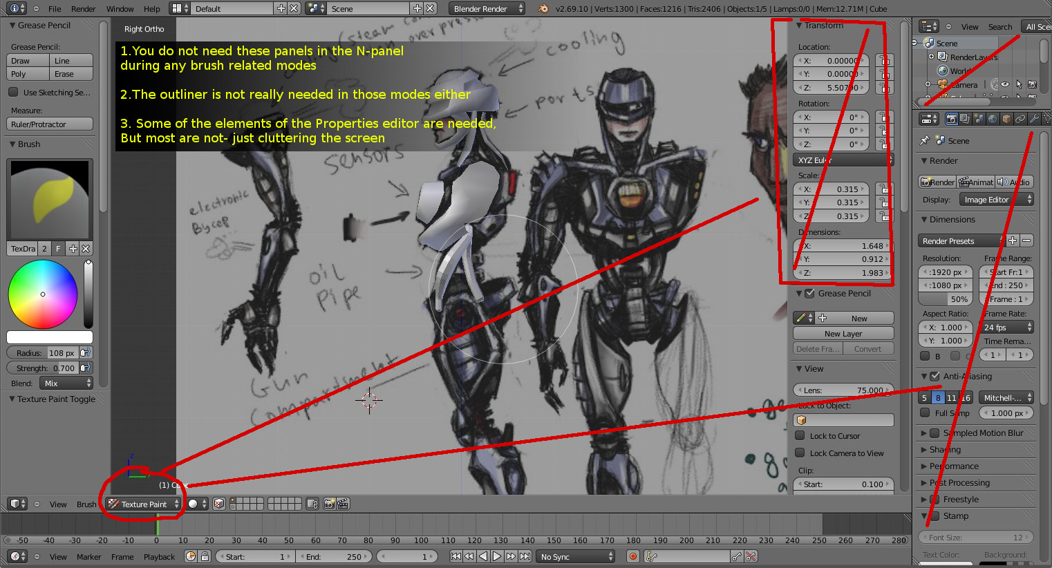
Blender UI design proposal - mode sensitive N-panel

I spent some time mocking up another GUI proposal for blender. The thing that triggered that enthusiasm in me was this video.

So my reaction naturally was to question the decision to put the layers inside the toolbar. And prompt the developers to consider using the N-panel instead. In order to make decisions like this fit well with the rest of the already established design, I took the idea even further and filed another UI proposal at the official wiki.


problems

1. The current N-panel is showing irrelevant information to the editing mode that you are in (for most cases)
The N-panel editor in the 3d viewport always shows the same information/properties in all modes. As a result you get a lot of irrelevant stuff to scroll through in most editing modes. The user wouldnt need to alter the rotation or the translation of a mesh while working in texture paint mode for example. They wouldnt need to access the "Motion tracking" panel in most modes.

2. Screen Space ~
Blender's UI is currently not using it's screen estate very well. The interface is wasting space to display a lot of irrelevant information when the user is texture painting for example. The properties editor is rarely accessed to set a custom brush or do some other small thing. And since it requires effort to hide completely, it just sort of stays there most of the time.
The N-panel on the other hand is easy to toggle on and off. This is distracting to old users, steals valuable canvas screen estate (artists)

3. The interface makes you work ~
The user also has to manually navigate to the required tab in the properties editor and know where to find the feature that would aid their task.

4. The properties editor is not available in most of the other layout presets~
There are a few items in the Properties editor which the user has to access in other editor windows, such as the image editor for example. But the properties editor is not available in the uv unwrapping layout preset or the image editor. It takes a lot of horizontal space as it is wide.
It is not available in the texture editor window. The N-panel however is available everywhere!

solution


To solve a lot of this cluttered interface issue and also speed up workflow by reducing the need to deal with switching tabs in the properties editor and looking for stuff, Blender's N-panel can adopt some of the T-toolbar behavior.
It is already planned to get the tabs.
My suggestion is:
1. Make the N-panel sensitive to the editing mode that you are in- so it displays information/properties that are relevant to what you are doing. Just like the toolbar.
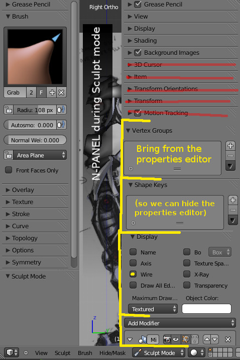
2. Since the N-panel already shows object properties (such as object coordinates in object mode), I don't see why we can't also move/duplicate some of the items in the properties editor to the N-panel. Everything in the properties Editor that is relevant to what the object mode needs needs to go to the N-panel's object mode.
We only need a few of the items that are found in some of the properties editor tabs.
if we move/duplicate some of the properties panels to the N-panel, we will allow the users to entirely hide the big fat Properties editor and outliner while they are not needed.
Some examples of items that are in the Properties editor, and would be useful in the N-panel:
  • n-panel in object mode: modifier stack,
  • n-panel in texture painting: Materials and textures lists (to switch between and edit textures),Textures>brush type(to set new brush textures), Vertex groups list (for masking), UV maps list,
  • n-panel in Edit mode: modifier stack, UV maps,
  • n-panel in sculpt mode: modifier stack, Shape keys, vertex groups, Textures>brush type (to set new brush textures),
  • n-panel in vertex paint mode: todo
  • n-panel in Weight paint mode: todo
  • n-panel armature - edit mode: todo
  • n-panel armature - pose mode: todo
-The N-panel is not present only inside the 3d viewport. It is also available in the Image editor and other blender editors. So this design logic can be beneficial to all of blender's layouts.

Conclusion

As you can see from this mockup, with a bit of improvement on the N-panel, Blender can look much cleaner!
-It can be much more intelligent in guessing what you need depending on what you are doing and show only relevant information. 
-The user gains a lot more screen estate for the working area.
- The overall interface design is more predictable and it fits with some of the already established design concepts.
-Improved full view mode workflow.


Proposal 2 - Better GUI for animators. 
Link to wiki here: 
http://wiki.blender.org/index.php/Dev:Ref/Proposals/UI/Better_gui_for_animators

Outlining the usual set up

You need to have your graph editor to control the spacing, you also need to be able to easily select controls visually - so a 3d viewport big enough for you to be able to rotate around the target character and select their controls. You need to have the N panel channel box- to see the values in their numeric form and change them. Finally- you need to have a constant look at the camera that the final render is going to use- this is particularity important not only for staging, but also the silhouette of the character. It's your end goal and as such it's what you should be constantly looking at when animating.
Now with all these things open- you need to set up your layout in something like this:
Whatever you resize will sacrifice something else. The most important screens you need to observe is the graph editor and the final render screen. When you make them too big, then its difficult to quickly and visually select controls of the character.

Picking controllers

First of all we can make selection of rig controllers much easier in blender and eliminate the need for a dedicate 3d viewport open simply to select them. Professional animation studios tend to use a "character controller picker". This is a 2d panel that is basically a button maker. It allows the animators to generate buttons that select the character controllers- lay them down visually - by moving them around in 2d space over a screenshot of the character. The picker eliminates the need to tumble and orbit around the 3d character to get to their controllers. Some times controllers get obscured because of the pose,other controls or background elements. They are too small or hard to get to. So this 2d button map makes it super easy and quick to select multiple controls and add a keyframe on them.

Blender does not have a picker. My suggestion is to get one made in a plugin form and include it in trunk. It can make use of the toolbar tabs too! It would be extremely helpfull

Graph editor- overlay mode

This is mostly a GUI issue when you have one monitor. Maya has this issue too. Blender however has a feature that can be advantageous for blender users- but it is not making use of it. It can potentially help the issue.
When you use the graph editor- you need to have more space- both vertical and horizontal. But when the graph editor is sharing it with all of the other layout windows- it gets really tiny. This creates the need to do more zooming in and out- vertically or horizontally depending on how the graph editor window has been deprived of space.
I personally have it a floating window in maya- so I can resize and move it. But then again- it obscures my visibility over the 3d viewport that way. And I find myself constantly moving it around and resizing it.
Some times (again in maya), I have it at the bottom half,with the top half being shared between controller selector on and the left and a render can on the right. This however squishes my graph editor- depriving it of vertical space.
What I figured is though- I do not need to have good visibility of my character's details while posing it and changing the spacing. All I need really is to have a good look over how the silhouette looks like. Additionally the graph editor has a lot of negative wasted space while you edit curves. I look at 1-3 or 4 curves at a time- usually close enough to have fine control.
Now this proposal might sound a bit crazy, but it is something I always wished I had in any 3d software. Its a way to have a good look over both the graph editor curves and the 3d viewport at the same time- without sacrificing size. Whats even better- the actual curves are visually close to the character- my eyes dont need to travel up and down the screen to compare their shape and placement to the way they are affecting the character's pose at the in between poses. So much less effort for me that way!
We can take advantage of using the semi transparency we currently have in order to create an overlay mode for the graph editor. What I mean by that is pretty much the ability to view your 3d viewport (with the end render cam) as a background in the graph editor! The graph editor can be like a semi-transparent overlay we can turn on and off in the 3d viewport- while we are in pose mode.
Or we can have this as an option inside the graph editor- similar to how the compositor works- the ability to show the 3d viewport behind the f-curves.
This in my opinion can be a convenient option for animators, who are sick of moving windows around and resizing layouts when working with the graph editor. No other software has done it in my knowledge so it might sound risky, but it really can be a killer feature for blender.

Friday, January 3, 2014

GUI design suggestions and Mockups over the years (open source software)

I've been a fan of open source software ever since owning a personal computer. No, seriously!
One of the greatest advantages of open source is it's community driven culture. Those who use it also design it- everyone can contribute to the source code. And hey, if you are not a programmer, you can make suggestions and mockups at the forum. And if your ideas are good, somebody will pick them up.  In this blog post I want to look back at my history with those sorts of interactions with the open source community. This will hopefully stand as an example of how fun it can be to be a user of free open source software and a part of it's community!

Vector linux 
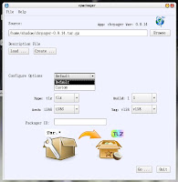
Some time in 2006 I started using Vector Linux- a Canadian slackware based distribution. It's wonderful speed and clean design was a perfect replacement of the ugly/slow windows xp that my old computer choked on. It looked better and worked faster than windows 7. It was good, but wasn't perfect - I am not easily pleased. So I contributed directly to it by:
- Compiling and building packages for software that wasn't available at the repository
- Reporting bugs
- Making desktop wallpapers (embarrassingly ugly ones too :D)
-And finally making icons and mockups for an in-house app for building packages, called Vpackager. This is sort of the first time that I can remember doing any interface related work.


Mypaint 
I have been actively proposing features at the forum and the wiki, ever since the early days. These are generally in the form of UI mockups and descriptions.
One successful proposal I made was on top panel widgets- for recent brushes and recent colours.Also right side buttons to toggle on/off the side panel.

Today this is (sort of) how mypaint works like. It has a top panel with brush widget button and a color widget button, among other widgets. The developer took the idea and implemented it in a more polished design - he combined the recent brushes with the available brushes list. Also the recent colors with the current color selection dialogue - in one widget. That is even better than my proposal! He also took the side panel toggle buttons idea! How great is that :D

Pencil animation wake up call
Pencil animation is one of my favorite pieces of software for animation pencil tests. It's available for linux,windows and mac. However it is an unfinished piece of software - lacking many basic features that are much needed to save time on workflow.
One of the reasons for that was the main developer who left at one point. The code base got old and difficult to compile and maintain on newer versions of linux. In fact- almost impossible to compile. It was dying!

So, I made a new thread at the community forum- explained why I think pencil has become abandonware and also prompted the main devs and moderators on the forum to explain some of the history of this downfall a little bit more.
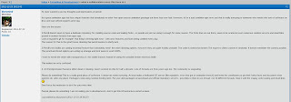
What this post caused was a wake up call. It might have been something that was going to happen anyway, but to me at least it seemed that the post outlined goals for the rebirth of pencil. Proposed not only by myself, but by those who have experience in development and know the codebase to some level.
It triggered more developer notice in the open source community, with LWN website using it as a reference to spread awareness on the issue!

Pencil animation was then renamed to pencil2d. The new devs are doing a wonderful job now. It has some much needed features - a better onion skinning to name a few. If you would like to support the work on it, please share the website with your friends, make something with it and share it, or donate.

Blender Interface - Andrew Price UI fiasco, putting down the fires!
Some time in 2013 Andrew Price made a controversial UI-remake proposition that set the entire Blender community on fire! His name was popping on every single post in threads that are not even related to Blender's UI. While he successfully outlined valid issues with the current interface, the proposed solutions were not ideal for anyone with any experience in blender or 3d software.


The blender developers were under a lot of stress, with a mass of people (mostly new to Blender) demanding a complete rewrite of blender's current UI or even worse- a new fork of blender with Andrew's interface.

In the case of Pencil animation-a zombie project- the fork was the only way to continue it's life. With Blender however, a fork can seriously damage it's currently wonderful active development health.

So I started a new thread at Blender Artist - asking those who are pro Andrew's proposal to outline in bullet points what it adds to the current design. Those who are against it- again in bullet points- state concerns over the proposed design.
And to my surprise- actual interface developers and some of blender's main code maintainers replied in it.
In general it became clear that the interface proposal is under-baked, but also that Andrew had valid points that developers should address.

I made some suggestions in the thread- instead of redesigning the current GUI , try to build on top of the design elements that do work. Address the standing issues by looking into how other software has solved them. At that point I made a proposal to look at Modo's tabbed layout interface.  Start using tabs in blender's toolbar- so tool icons are not a scrollable moving target. Start using tab buttons to switch to different workplace layout presets. Make the actual tab buttons we currently have look more like tab buttons.
The devs are now working on a tabbed interface proposal here. This might become available in the future in trunk if everything goes well.

The outcome:
Andrew Price came clean and said that his proposal should be revised. His whole presentation is all about what he learned from the experience and what he got wrong.
Then Brecht himself came out and spoke about the existing problems with the UI. He identified all the problems we've been noting in the thread.
Ton explained how the foundation feels about it too-  He patiently explained why a complete interface rewrite is a terrible idea.

If Andrew did something well, it's stirring things. The foundation formed a UI team and is now working on improving the UI in blender.

Blender interface mockups- GUI designs and suggestions
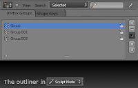
Seeings at to how now there is a GUI team, I decided to continue contributing with mockups and suggestions at the official WIKI.
Here are some of the ones I have made so far:

*The mode sensitive tabbed outliner , which includes:


-The merge of the materials and textures lists


-Some changes to the properties window


*Asset manager - an easier way to manage reusable resources in blender.
 And finally
*First time user splash screen.